Line Chart
The line chart component is used to view and compare how data has changed over time.
* Required property
stringstringstringstringstring: CSS width value120px.
JSON stringnull can be used to represent missing data.
booleanfalse.
stringnull represents no unit.
booleanfalse.
string: comma-separated numbersHighlight a section of the chart
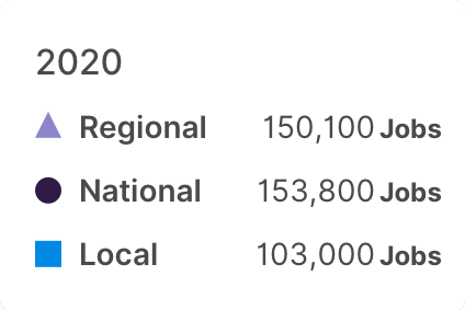
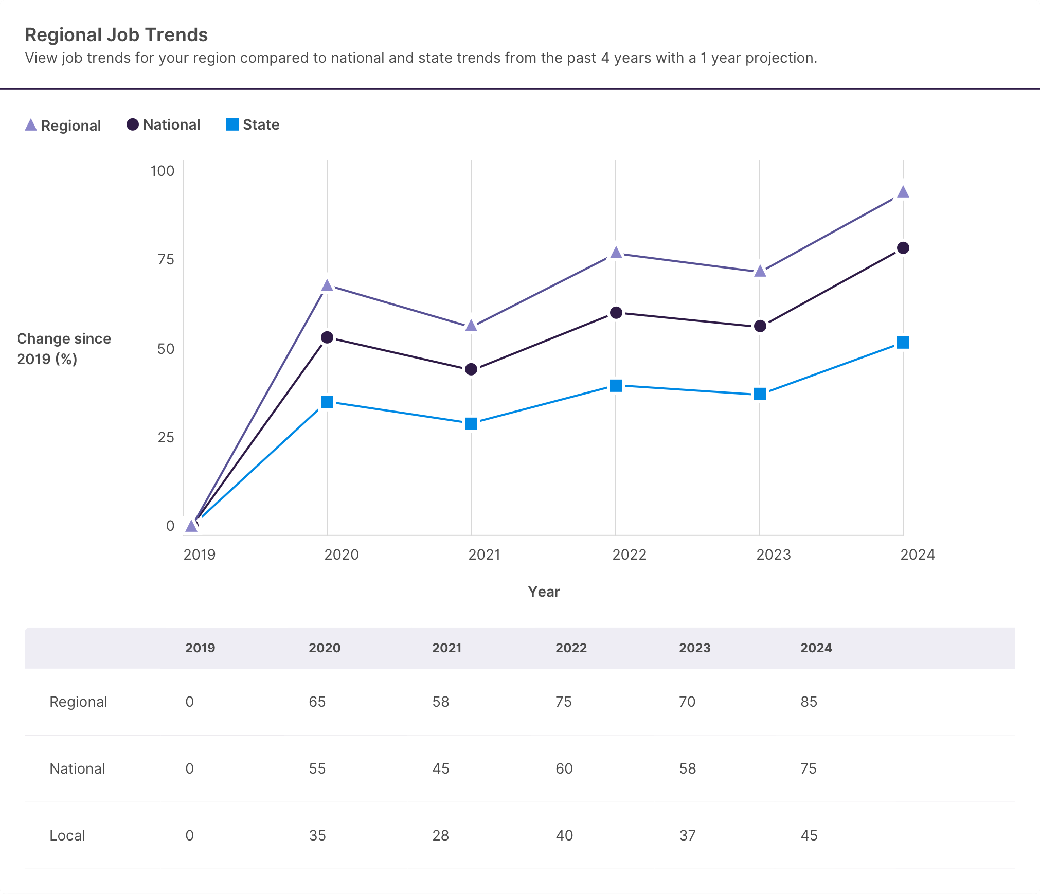
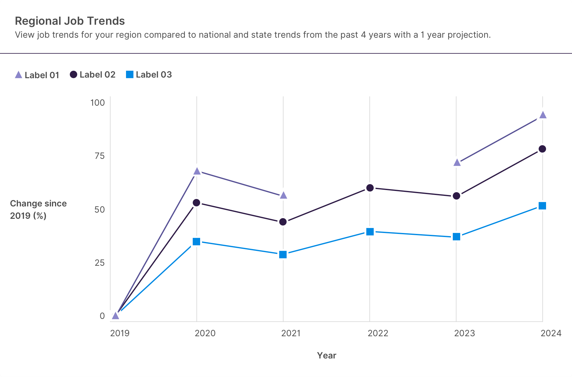
stringstringstringRegional Job Trends
View job trends for your region compared to national trends from the past 3 years with a 3 year projection
University Enrollment by Program
Usage in HTML
Edit the code below to see changes reflected in the example above.
Usage in Elm
Code generated from HTML.
Screen Reader
- Screen readers announce the following when the user tabs onto a line chart: “{chart title} interactive chart. Use tab and arrow keys to navigate the chart. {chart description}”
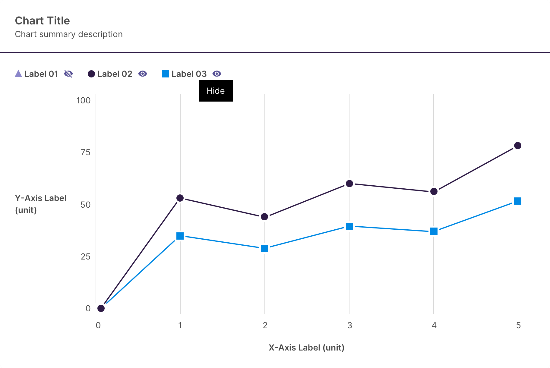
- When the user moves to the legend, screen readers will read “Toggle line visibility list with N items”, then focus the first visibility toggle.
- When a visibility toggle is focused, screen readers will read “Hide {line label} toggle button {button state}.”
- When a line is focused, screen readers will read “{line label}, line N of M with X data points” then proceed to read data point information.
-
When a data point is focused screen readers will read “{x label} {x value(unit)} {y label} {y value(unit)} {line label}.”
- If comparison is enabled, the above message will be appended with “Change since X, N percent”. For example, Semester Fall 2022 Students 213 Continuing Education. Change since Spring 2022, 3%”
- If the data point falls within a highlighted area, the above message will be prepended with “highlighted (or supplied qualifier).” For example, “projected Semester Fall 2024 Students 389 Continuing Education
Keyboard Support
| Key | Function |
|---|---|
| Tab | Move focus from legend visibility toggles (if present) -> chart data. |
| Arrow Left Arrow Right |
|
| Arrow Up Arrow Down |
|
| Space Enter | Toggle state of visibility toggles. |
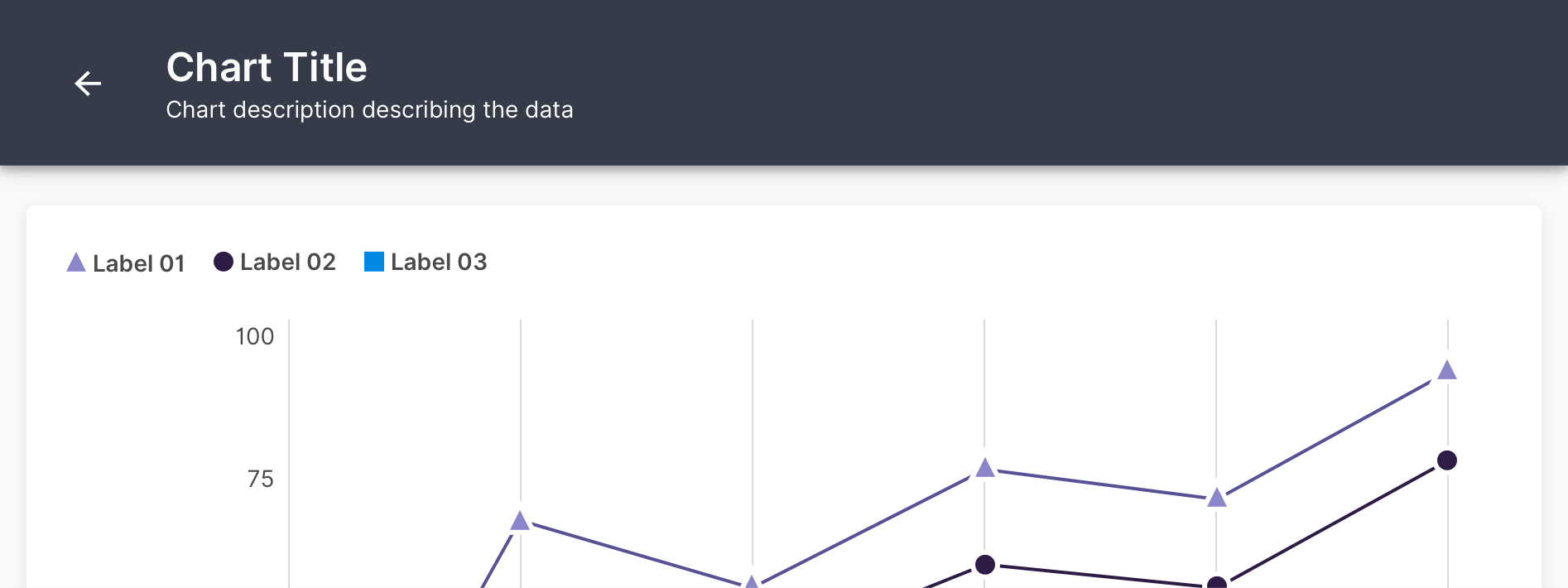
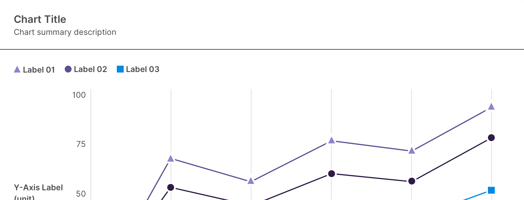
Anatomy
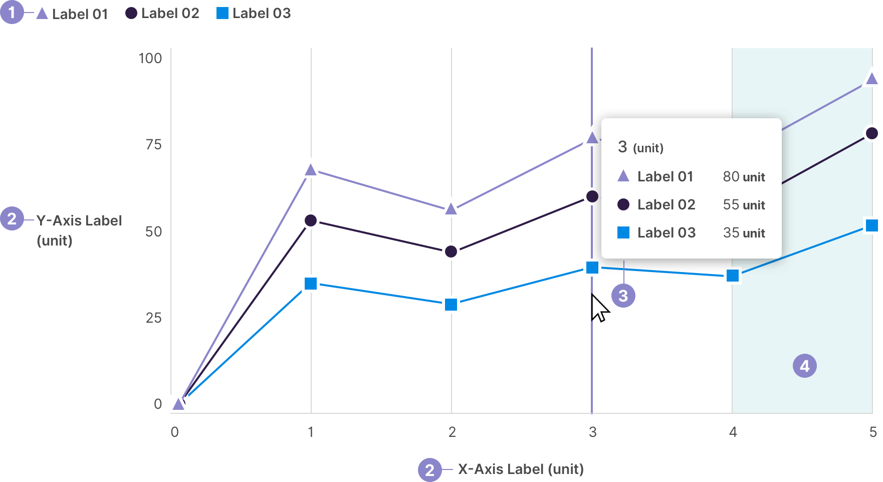
- Legend - Label the symbol
- Axis Labels - The X and Y axes need to be labeled and include the unit. The increment of numbers for each axis needs to be consistent.
- Detail Popover - Include the x-axis point at the point of hover, each label with data at that x-axis point, and the value and unit of the data points.
- Highlight Section - Some use cases require a section on the chart to be highlighted to call attention to a specific area. This is optional.
Line Symbols
Lines need to be distiguishable by color and symbol. Below is the symbol and color palette in order from 1 line to a max of 7 lines. Each symbol has a 3px white border.

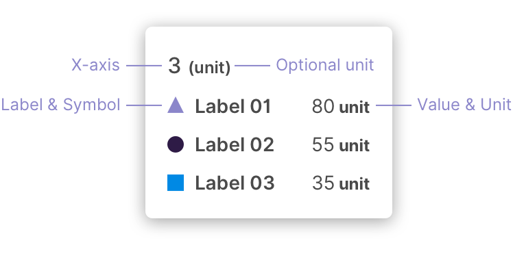
Detail Popover
Default Popover
Indicate the x-axis value that the popover opens at. The unit of the x-axis value is optional. Display the symbol, label, and value of each line charted at the x-axis point of hover. The line label and symbol is left aligned, while the values, unit, and comparison values are right aligned.
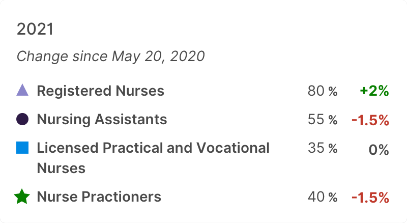
Detail Popover With Comparison
The detail popover can include the percentage difference from the previous data point. Indicate the difference with colors that use either positive or negative connotations to correlate with the positive or negative difference in values.
X & Y Axes
Labeling
Labeling of the x and y axes is required. Ensure the label accurately represents the data. Units can be added after the label in parenthesis but it is not required if the label is descriptive enough.
Numbers
Numbers on the y axis can be shortened once they reach thousands by using the “k”, such as “100k” for 100,000.

Numbers in the popover should not be shortened so that the user knows the exact value.
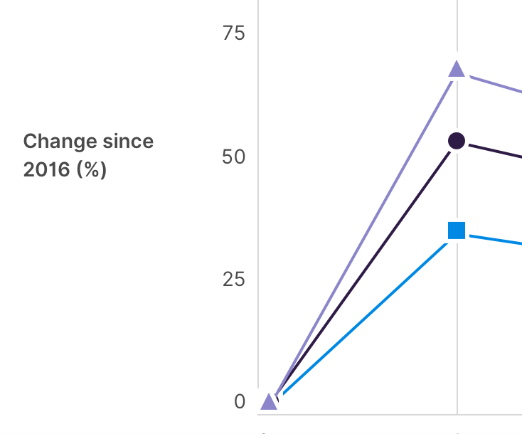
The range of values for both axes is determined by the data. Only the y-axis can include negative values.
Chart Layouts
The line chart can be used in any layout container that makes sense, however it does need to be paired with a title and description. The description should explain what the chart is representing and include key takeaways if possible to give context to the user before they view the chart. These elements can be added using a card component or full page immersive.
Optional Toggle
Line visibility can be toggled in order to focus on individual lines. This removes the data from the chart visually and for screen readers.
Use the material icon “visibility” to indicate the line is visible with a tooltip that says “Hide” to indicate what happens when selected. Once selected, the icon changes to “visibility-off” to indicate the line is hidden, with a tooltip that says “Show” to indicate what happens when selected.
Optional Table
The table can be paired with the graph as another way to display the same data for maximum accessibility. This a pattern that can be followed and is not included in the component.
Missing Data
Chart Display
If there are missing data points, the chart will still plot all available data points and display a gap between the data lines.
Popover
When hovering over an area where there is missing data, the popover displays “No Data” instead of a value. The comparison popover will display “No Data” for data points that have missing data as the previous point.
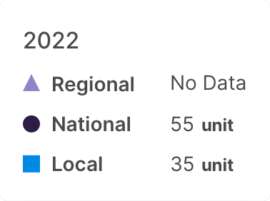
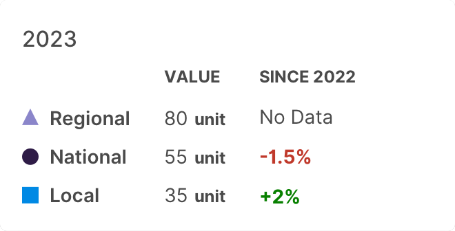
Chart Responsiveness
As the chart width decreases, the number of vertical lines and x-axis values reduces in order to fit within the decreased space. The popover is still displayed on hover at every size of chart.
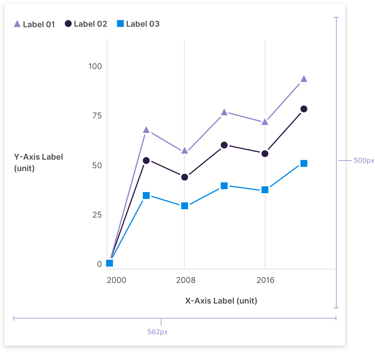
The chart has a min-width of 562px, and height of 500px. There is no max width as the chart will span the entire width of the container.
It is recommended to view line charts on larger browser widths. If viewing on a smaller viewport than the min-width, the chart can be scrolled horizontally.