 Ripple
Data Visualization
Comparison Charts
Comparison charts are used to highlight differences and similarities between two or more datasets. They enable users to quickly grasp relationships, identify trends, and draw conclusions by placing data side-by-side.
Overview
This can include comparing the values of one category to another, ranking data, or showing performance over time. Use Composition charts to show how data relates out of a total when possible.Best Practices
Bar Chart

Best For
-
Comparing many categories
The vertical layout of bar charts is better suited for long labels and a larger number of categories.
Data Scales
Nominal, Ratio
Column Chart
Best For
-
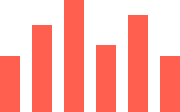
Comparing few categories
The horizontal layout of column charts makes it difficult to display many categories at once.
-
Comparing categories across time
The horizontal layout shows the chronological order more clearly than the bar chart.
Data Scales
Nominal, Interval, Ratio
Use Cases
Compare values across a single category
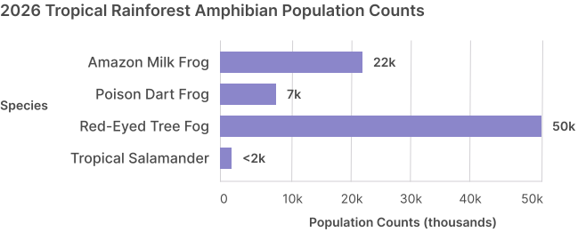
- Use a single color from the Discrete palette
-
Use as many bars as needed, but use caution with the column chart
There is no limit to the amount of bars that can be used, but column charts are more prone to horizontal constraints that could limit the amount of bars to be seen in one view.
-
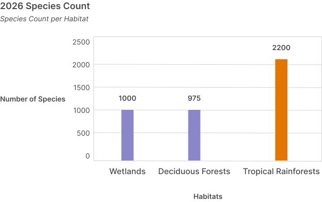
Use a secondary color from the discrete palette to highlight a specific category
Use the discrete-05 color unless a specific color is required for the context.
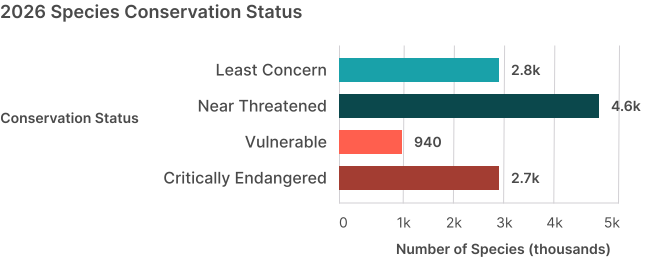
Compare multiple categories that have status associations
-
Use the Semantic color palette for multiple categories that have status associations
You don't need to include the legend because the labels are right next to each category.
-
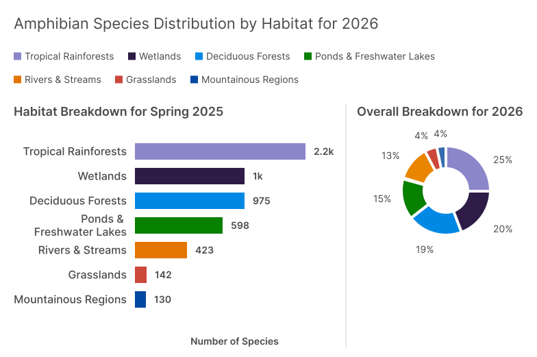
Use no more than eight categories to keep slices visually distinguishable and color-accessible.
Each category must use a unique color.
-
Apply discrete color palettes only when necessary to differentiate categories.
Use single colors on bar charts with direct labels, and reserve multi-color palettes for legends that span multiple charts. To maintain readability and color accessibility, categorical charts (such as donut charts) limit to a maximum of seven slices.
Compare multiple categories across groups
-
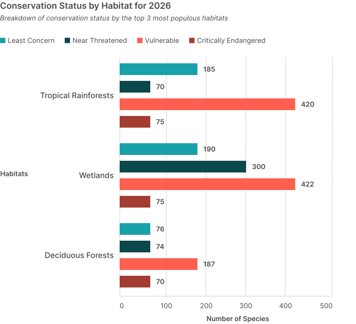
Use grouped comparison charts to compare values across groups
Grouped comparison charts reveal differences and similarities between both group-level and item-level categories, e.g. comparing faculty performance by department and assignment type, or evaluating outcomes by course and term.
-
Grouped comparison charts must use legends to identify the categories within each group
Each group can have up to eight categories for semantic categories or up to seven for discrete categories. You can use as many groups as you need.
-
Each group must include the same categories for comparison
All categories within a group must share the same legend to compare the same categories.
-
Do not use a single color for categories
Unlike the non-grouped variants, each category must have a distinct color for differentiation.
Resources
Bar Chart
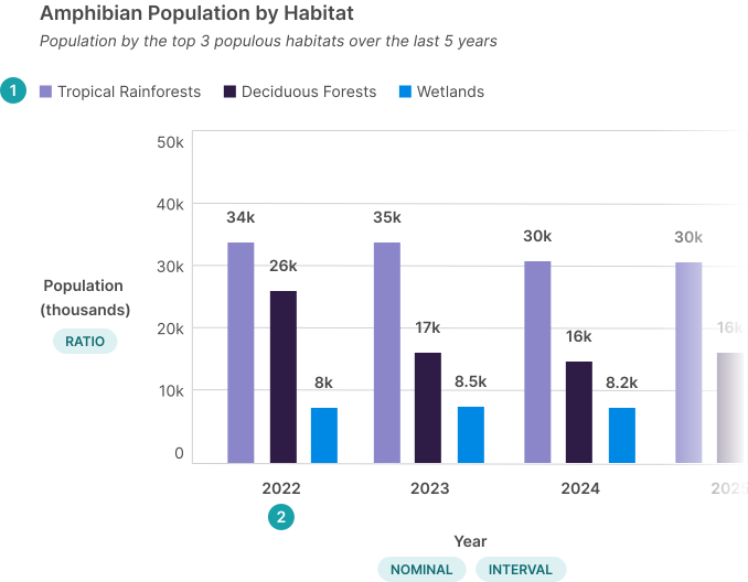
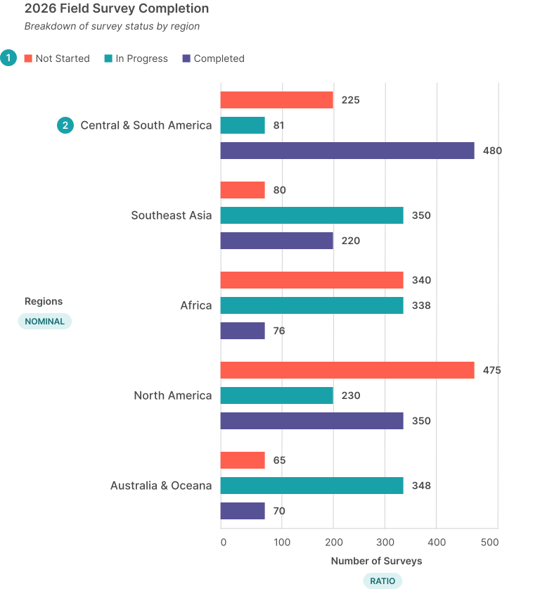
Use labels to explain the chart. The component requires a label for screen readers that can be visually
hidden if you want to display the label elsewhere.
The subinfo description can be used to describe the chart further. This is the category name for the bars.
The category axis uses the
Nominal data scale
and specifies the type of data the chart is broken down by. The label is optional, especially if the
chart label and sub-info describe the chart.
The value axis uses the
Ratio data scale
and specifies what the data is tracking. The label is required to give context.
The value can show amount or percentage.Anatomy
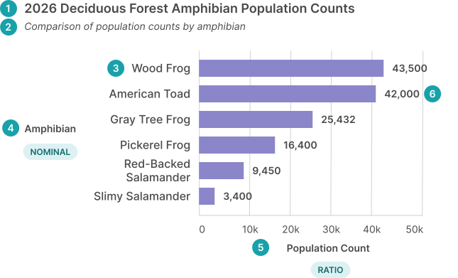
The legend is required to specify the bar colors. This is the name for the group of categories.Grouped Variant Anatomy
Column Chart
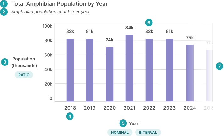
Ensure there is a label somewhere on the page explaining the chart. The component requires a label for
screen readers that can be visually hidden if you want to display the label elsewhere.
The sub info description can be used to describe the chart further.
The value axis uses the
Ratio data scale
and specifies what the data is tracking. The label is required to give context.
This is the category name for the columns.
The data on the category axis uses the
Nominal
or
Interval
data scales and specifies the type of data the chart is broken down by. The label is optional, especially
if the chart label and sub-info describe the chart.
The value can show amount or percentage. The chart becomes horizontally scrollable when there are more columns than can fit in one view.Anatomy
The legend is required to specify the bar colors. This is the name for the group of categories.Grouped Variant Anatomy