layout
Grid
We use grids to provide structure to the arrangement and spacing of page content and elements to create consistency and maintain visual hierarchy in layouts across any device.
Layout Grid
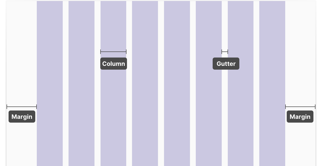
A layout grid is made up of columns, gutters, and margins. Content is placed inside the areas of the screen that contain columns. Gutters are fixed spaces between columns that help separate content, and margins are fixed spaces between the content and the left and right edges of the screen.

We apply layout grids to responsive page areas where content must scale, resize, and reorder depending on screen width. We refer to these as fluid page areas.
Fixed vs. Fluid Page Areas
In a typical layout, we may have both fixed and fluid page areas. Unlike fluid page areas, fixed page areas maintain a fixed width or height and the content inside these containers doesn’t scale responsively across screen widths. Both fixed and fluid page areas use breakpoints to determine when a layout needs to change significantly.
For Sketch templates of commonly used layout grids and instructions for creating layout grids, view our grid definitions in our Figma UI Library.
Responsive Behavior
Content inside fluid page areas adapts responsively depending on screen width. There are three ways content may behave across various device and screen widths: fluid resizing, stacking, and transforming.
Fluid Resizing
Fluid resizing works best for full-width containers in fluid (responsive) page areas. The width of the container scales down as the screen size gets smaller, and the content inside the container may rearrange at specified breakpoints.
Example of fluid resizing from Planning & Self-Study: The full-width “Template Content” card in the fluid content area scales down as the screen size gets smaller. The left-hand table of contents is a fixed page area and doesn’t scale responsively as the screen width changes.
Stacking
Stacking is used for side-by-side containers (and content inside containers) inside fluid content areas. As the screen width gets smaller and the available content area is reduced, side-by-side elements stack vertically.
Example of stacking from Planning & Self-Study: The side-by-side cards stack vertically as the screen width gets smaller.
Transforming
Transforming may be used for significant change when one UI element isn’t able to effectively communicate information across both large and small screen widths. In this case, the layout may switch between different displays at specified breakpoints.
Example of transforming from Planning & Self-Study: As the screen width gets smaller, the doughnut charts switch to bar charts in order to communicate the same level of information on the smaller screen.
Grid Implementation
The grid divides an area into columns in order to simplify coding layouts just by adding CSS classes. The widths of elements within the grid are measured by the number of columns they span. The main grid is divided into twelve columns. As an example, in order to create a two-column layout of equal widths, each column would be six grid columns wide. But, you could also make the columns unequal, for example three grid columns and nine grid columns wide. It’s that easy!
To use the grid, add the class wm-grid to divide a container
into columns. Then add the class wm-grid-row to the element
containing the content that is to be sized (the row’s width determines the
width of the grid columns for its child elements). Finally, add the
appropriate class name to each element in the row appending the number of
grid columns it should span.

The grid is responsive based on a number of standard breakpoints. If we go
back to our example of the two-column layout with columns of equal width,
making the columns full-width for viewport widths 1440px and below would be
as simple as adding the following classes to both of our elements:
wm-grid-col-6 wm-grid-col-lg-12.
The classes and number of columns for each available breakpoint
| Breakpoints | Class prefix | Number of columns |
|---|---|---|
| All Widths | wm-grid-col | 12 |
| 1440px | wm-grid-col-xl | 12 |
| 1280px | wm-grid-col-lg | 12 |
| 1024px | wm-grid-col-md | 10 |
| 768px | wm-grid-col-sm | 8 |
| 414px | wm-grid-col-xs | 4 |
| 320px | wm-grid-col-tiny | 4 |
Take a look at this CodePen for a working example.