Forms
Forms
We use forms to collect information from users and to allow users to configure options. There are two types of inputs used in forms: text inputs and data inputs.
Text Inputs
Text inputs are used whenever users are required to manually enter text inside an input field. Text inputs must display top-aligned labels in all instances, and a character count in instances where a maximum number of characters is allowed.
Optionally, text inputs may display a toggletip next to the input label that contains supplementary information, placeholder text inside the input field to guide users in filling it out, and/or help text below the input field for further guidance or details.
For text inputs requiring multiple lines of text, use an expanding text area instead of a singular field.

Data Inputs
Data inputs refer to form elements that allow users to select inputs from a pre-determined set of options or a limited range of values. Below are examples of available form elements and a guide for appropriate usage of each element.
| Form Element | Usage |
|---|---|
| Checkbox Open CodePen in a new window |
To select one or more options from a list
|
| Radio Button Open CodePen in a new window |
To select one option from a list
|
| Dropdown |
To select one item from a longer list. Use a dropdown
instead of radio buttons for lists containing more than five items
|
| Multiselect |
To select multiple items from a longer list. Use a
multiselect instead of checkboxes for lists containing more than five items
|
| Toggle Open CodePen in a new window | To select one of two binary options (such as on/off, yes/no, etc.) |
| Datepicker | To select a single date or a range of dates from a calendar |
| Timepicker | To select or input a specific time or a range of time |
| Uploader | To upload and attach one or more files to a form |
| Search | To filter through a pre-populated list of options to select one or more items |
| Tag Input | To create a tag or search through a pre-populated list of tags to add a tag |
Form Submit Accessibility
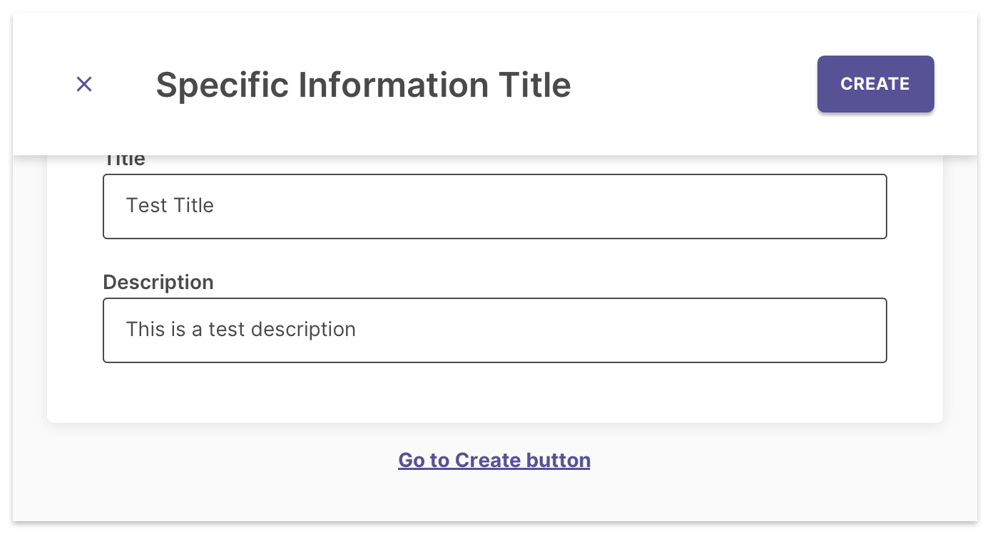
Ensure that there is an action below the form to take the user's focus to the submit button if the button doesn't semantically follow the last input in the form. This is handled using a hidden button that becomes visible on focus when the user tabs past the last form input. Label the button "Go to" + button name + "button". Check out our CodePen (link opens in new window) for a working example.

Do’s and Don’ts for Forms
Do:
- Keep form input labels concise and in title case.
- Use help text to give additional, specific details or guidance.
- Use toggletips sparingly and only for supplementary information.
- Reflect the width of the form field to the expected length of the content inside it wherever possible.
- Use expanding text areas instead of single field text inputs whenever multiple lines of text is expected.
- Group inputs for related tasks under section titles for longer forms.
- Mark required fields with an asterisk. View guidelines for Required Fields for more details.
Don't:
- Omit labels for any inputs.
- Use placeholder or help text in place of input labels.
- Provide placeholder or help text unless necessary.
- Keep essential information hidden inside toggletips.
- Use radio buttons and checkboxes for lists longer than five items. Instead, use a dropdown or multiselect.