Components / Library Version 4.10.0
Uploader
The uploader component is intended for situations where users need to upload files for later access, not for entering data into our system, such as uploading a .csv file. Currently, the component lacks filtering capabilities, so it cannot be used if your pattern requires a filter section.
The uploader consists of the input and the file list. It displays a list of files as children of wm-file elements. When users select files, the component triggers the wmUploaderFilesSelected event, exposing the files for validation, uploading, and addition as children. When users interact with a file's preview, delete, or download button, an event is emitted, allowing you to create a callback function to handle these actions (see the API tab).
Use the File List Component for use cases where a read-only list of files is needed and no other files need to be uploaded.
 Use the
NB: To reflect file upload progress in wm-uploader and ensure proper screen reader accessibility, wm-file progress must be kept up to date. See the Properties tab for more information.
 NB: To reflect file upload progress in
 * Required property
stringstringrequired-field error
"Please add at least one file".
stringpdf txt log xml doc docx xls xlsx ppt pptx gif jpg png csv. Note: Validation and error message
setting should be handled outside of the component.
stringf1c0).stringstring100 MB. Note: Validation and error
message setting should be handled outside of the component.
numberbooleanlabel property.
last-updated | size | uploaded-by | all | nonelast-updated.
Properties of the children wm-file.
stringstringstringpdf, not application/pdf.
stringstringpreview download delete. Defaults to
download delete.
string1/28/2020 5:29 PMstringstring3 MB.stringUploaded by Alonso, Fernando.Please note that the examples below do not actually upload a file to a server.
Usage in HTML
Edit the code below to see changes reflected in the example above.
Javascript Sample
Example code for functionality.
Usage in Elm
Code generated from HTML.
wmFilesSelected.
Properties of the children wm-file.
The number of files uploading is shown as a notification and announced via an aria-live region.
When a file is deleted, you should announce it with the snackbar component.
Here you will find documentation on design decisions around states, responsiveness, and behavior guidelines for the Uploader component.
Example
Anatomy
Uploader Action
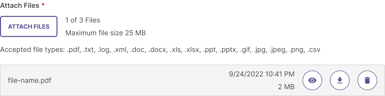
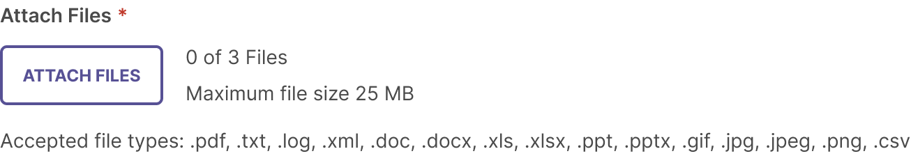
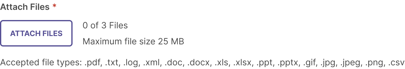
The Uploader component consists of a secondary button with an icon, number of attachments that can be uploaded as well as maximum file size, and helper text of the accepted file types.
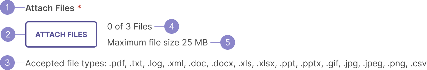
- Label (optional)- The label can be used to describe the uploader and indicate that it is required.
- Button - The button is a secondary button with an icon. Language for the button should use the same words that a descriptor might have. For example, If the instructions say, “Attach important reports and documents that demonstrate your organization’s value and design, as well as evidence of success and improvement”, then you would use the language “Attach Files” in your button. Always pair the text with an icon that is appropriate with the language.
- Accepted file types - List the files accepted by the uploader by type. For example, group the image types together, then documents, then videos.
- Number of attachments (optional) - Next to the button, you can include a count to show the number of files added out of the maximum allowed, for example, “X of Y files.”
Tip: Make sure the language is consistent with the button language. - Maximum file size - To the right of the upload button, the maximum file size automatically shows if the property is set on the component by the developer. By default, it is 100MB, but may change depending on the use case.
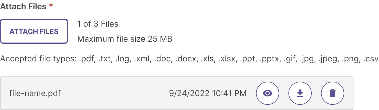
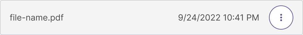
Uploaded File
Once a file is uploaded, a file block is added below it.
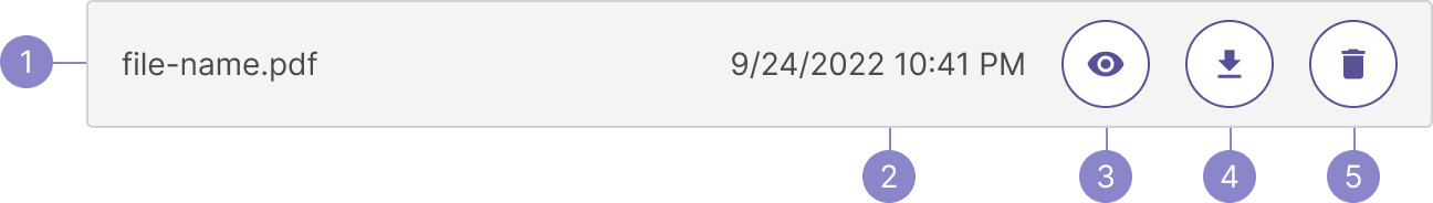
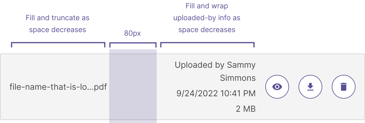
- File name - The file name is always present and has the file type at the end of it.
-
File info (date uploaded, file size, uploaded by) (optional) - These info properties are right-aligned to the buttons and can be displayed together. The date format should always be MM/DD/YYYY and use a 12 hour format for the time. File size format should always be ##MB (or KB, or GB, depending on the size). The uploaded by name will wrap depending on the length of the name and space available. Always prepend “Uploaded by” before the name so it is clear as to why the name is attached to the file.
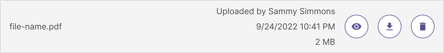
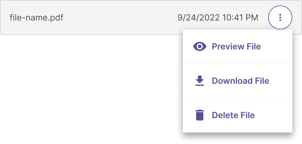
- Preview button (optional) - If the use case calls for it, use a preview button. If preview is to be used, it is the first icon button shown.
- Download button (optional) - If the use case calls for it, use a download button. Download comes before delete, but after preview (if used), and can also be used on its own.
- Delete button (optional) - If the permissions for the user allow it, use the delete button. If it’s grouped with other buttons, it is the last icon button shown. It can also be used on its own. Once clicked, it will trigger a snackbar to alert the user that the file has been deleted.
States
Empty
When no files have been uploaded.
New file uploaded
When a new file is uploaded, a check mark appears showing that the upload was successful. The checkbox persists for the duration of the session.

File uploaded
The label for how many files have been uploaded changes based on the amount of files that have been uploaded.
File block content combinations
The file block is flexible so that you can use three different buttons in different combinations or not at all, depending on what the use case is. Keep in mind that everything is optional EXCEPT for the file name itself. Think about the use case and what actions the user needs to make and what information is necessary for that particular user.


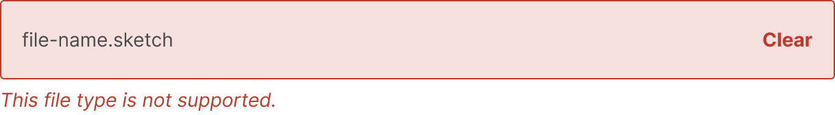
Error
If the user is trying to upload a file that is not a supported file type, or if the file is too big, an error is displayed. The user will have the ability to clear each error.
If the user has selected mulitple files at a time to upload, but that number exceeds the limit, an error will appear stating that the upload was unsuccessful.
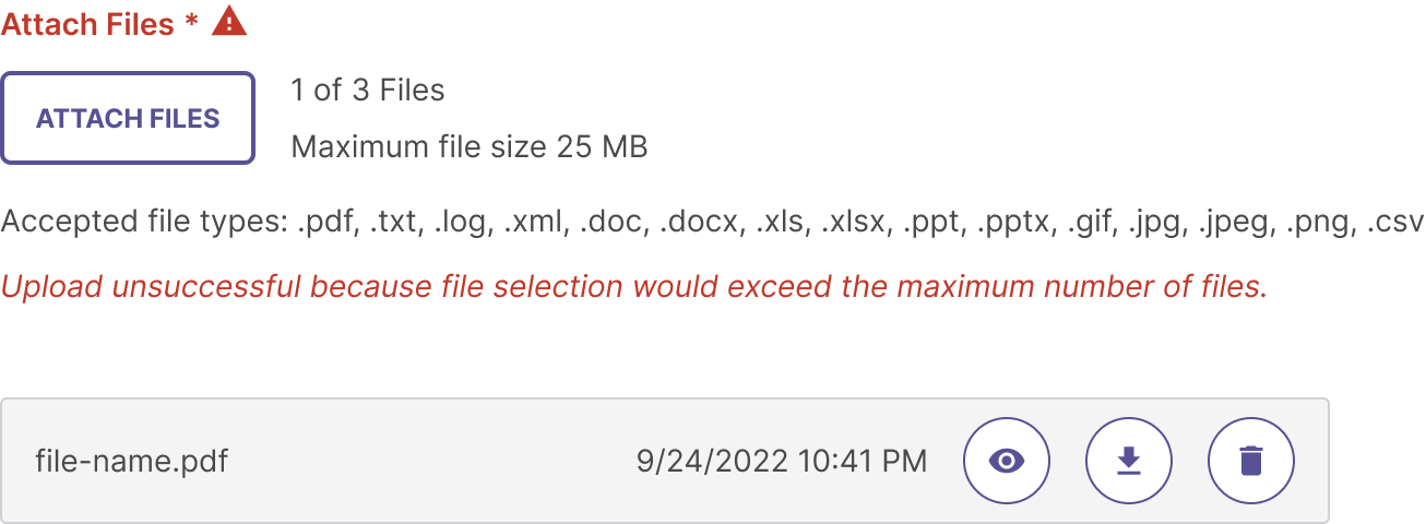
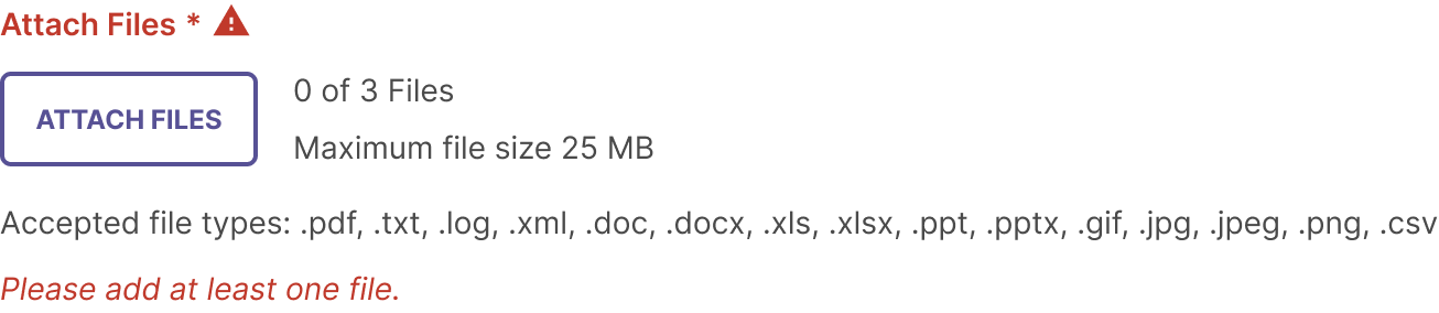
Required State
Use a label with an asterisk to indicate that a file is required. The label’s action verb should match the verb used in the button, i.e. “Attach your Capstone Files” with the button “Attach Files”, or “Upload Program Files” with the button “Upload Files”.
If no file has been added, an error state is displayed and the user will be prevented from moving on until a file is added.
Smaller screen sizes
Min and Max Widths
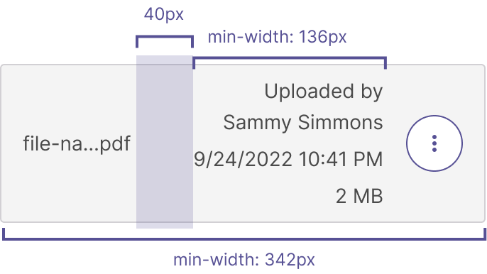
The uploaded file block has a max-width of 1140px and min-width of 342px. When the uploader is smaller than 500px, a truncated view of the file block is shown.
Actions
If there are two or more buttons needed for the file block, the buttons are wrapped in an Action Menu. If there is only one button, there is no need to change or remove any buttons. At this size, the date or file size are not shown.
Tip: Make sure that the overflow menu items are in the same order as the buttons it is replacing.

File Info
The file info is always displayed. The name wraps to multiple lines as the space decreases. The date/time and file size remain on a single line. Keep 80px between the file name and info section when the width is over 500px, and 40px when the space is less than 500px.
File Name
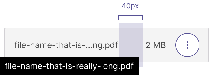
The file name will be truncated to fit the space using an ellipsis. The last two characters of the file name and document type will be displayed after the ellipsis (ex: file-name-th...ng.pdf). On hover a tooltip will appear to show the entire non-truncated file name.
File uploading
During the upload, the file block displays a progress bar at the top. Only the file name is displayed.
Once the file is uploaded, the user will see the green check mark as well as the date uploaded and any file block buttons.

Button behavior
Attach files button
The button type (secondary with an icon) will always be the same for the uploader. It must contain an icon and supporting button text.

Paperclip icon with the word “attach”
The icon should reflect what the button says

Upload file
In some cases, it might make more sense to use “upload file”
Disabled button with icon
Button is disabled when the maximum number of files has been reached.
File Action buttons
Once files have been uploaded, the file blocks contain a few different action buttons to choose from.

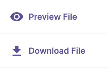
Preview
Opens file up in file preview mode.

Download
Downloads uploaded file to computer.

Delete
Removes the file. Always show a snackbar to alert the user it’s been deleted.

Overflow
Replaces the action buttons with a menu.