 Ripple
communication patterns
System Communication
The following system communication patterns conditionally appear on the page based on system status or user actions. For best usability, it is important to choose the right way to communicate with your users based on the priority of the message and complexity of the actions.
Dialog
Dialogs are conversational, straightforward, contain only text, and don’t require any complex interactions. Dialogs appear on top of pages and panels and disable the content underneath until the user interacts with the dialog.
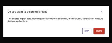
- Provide system feedback or information users need to proceed with their task
-
Confirms a single action
These are useful to confirm any destructive actions like deleting or unsaved changes.
-
Only contains text
Consider using a modal if more information needs to be displayed.
- Can trigger a snackbar after the user has acknowledged the action and the dialog closes
-
Do not trigger other layout containers
Flyouts and side panels cannot be triggered to open from a dialog.
-
Do not use more than one primary action
If more than one action is needed, consider using another pattern.
-
Do not use to display error messages
This blocks the user from accessing the page and fixing the error.
Banner
Banners are characterized by their location and severity. Their location indicates the specific product area they pertain to, while the way they appear is context-driven, whether it's on page load, system status update, or user interaction. The severity of the message determines the visual style they receive.
Location
Global
Global banners are located just below the top bar, directing to the right of side navigation, and above the main page content. Use global banners to display messages related to important site-wide issues that impact the entire product.
These banners stretch across the full width of the content area without any extra space on the sides.
Sectional
Use sectional banners to display messages that pertain to specific sections of the product. They are located right above the area they refer to, either directly above a section of the page or within a specific container.
These banners stretch across the entire width of the section or container and share the same spacing rules as the content they're associated with.
Severity
Supplemental
These banners appear on page load and are non-interruptive to the user’s workflow. They contain supplemental messages that are not urgent and do not require actions. They can be persistent or dismissible, and may contain a link to another page but do not trigger additional actions.
Dismissible, Non-interruptive, Supplemental, Optional Link

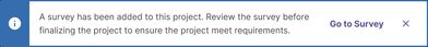
Informational
These banners appear upon a system status update or user action, but do not require immediate actions and can be dismissed without affecting the user’s workflow.
Dismissible, Non-interruptive, Optional Action
Warning
Warning banners appear when the current actions of the user may lead to undesirable affects or behaviors, appearing on page load or user action. These do not prevent the user from continuing their workflow, and the location should be interruptive to call attention to the importance of the message.
Non-Dismissible, Interruptive, Important, Optional Action

Error
Error banners appear when users must address an issue before continuing their workflow. Similar to warning banners, these can appear on page load or user action and should be interruptive. They should offer clear explanations for why these errors happened and how to fix them.
For instance these banners can be used to consolidate errors on form submissions. If there are more than two errors, we should show the total number of errors and link to the first one on the page. For further guidance on handling errors, please refer to our Error guidelines.
Non-Dismissible, Interruptive, Important, Optional Action, Block-Workflow

Best Practices
-
Use to display prominent messages and can include one related action
The severity of the banner determines whether the banner needs an action or can be dismissed.
- Place banners directly above the area they relate to
-
Do not cover content and do not make the banner sticky
Both global and sectional banners should scroll with the content they relate to.
-
Do not display more than one banner of the same severity at a time
There may be cases where multiple banners of different severities appear.
-
Do not add links within the message
All actions should be represented as buttons separate from the message.
Snackbar
A snackbar is a concise notification message that automatically disappears after 6 seconds. They are the least intrusive form of communication and should only be used for updates or actions that users can also find elsewhere in the interface. They may stack if multiple unique messages are necessary.


Links
Links can be included that relate to the action or event, but should not be essential for user interaction. If they are necessary, consider using a banner or dialog component instead. Including links will prevent the snackbar from automatically disappearing for accessibility purposes. Therefore, use links sparingly.
Best Practices
-
Use to communicate the successful completion of an action initiated by the user
This can include communicating the completion of adding or removing information, uploading a file, or submitting a form.
- Use a concise, simple sentence with a recommended maximum of 75 characters
-
Use descriptive and specific language for links
Ensure that links in snackbars are concise yet specific to the action or information they relate to. Avoid vague terms like “Learn more”.
- Use to open a new page related to the action, if necessary
-
Use to consolidate similar notifications
If multiple actions are being taken in quick succession (less than 6 seconds) that trigger similar snackbars, consider consolidating them into a single snackbar. For instance, instead of showing a snackbar for each item added, show one that summarizes the actions (e.g., “3 items have been updated”). For notifications that contain specific information about the action (e.g. file names, links), keep them as separate snackbars.
-
Do not use snackbars for every action
Avoid displaying a snackbar for every minor action the user takes, especially if the action is intuitive and doesn’t need immediate confirmation. For instance, do not use a snackbar for updates to the order of an item or name change when it’s immediately visible afterwards. This can overwhelm users and disrupt their workflow.
-
Do not use snackbars for actions that are immediately visible
If the result of an action is immediately visible in the interface (e.g., an item is added to a list or a field is updated), a snackbar may not be necessary. The visual change alone often provides sufficient feedback.
- Do not trigger other layout containers or inputs with snackbars
- Do not include more than one link per snackbar