Forms
Required Fields
Required fields inform the user which inputs are necessary to fill out to complete or move forward in an experience.
Required Fields Indicator
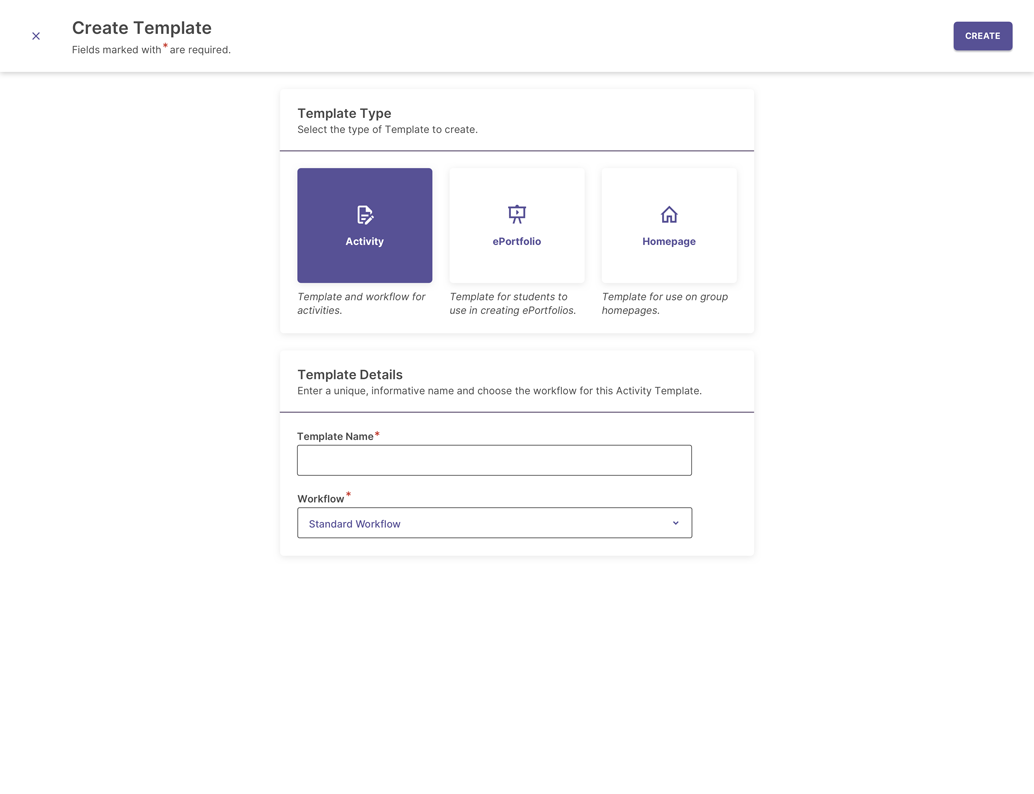
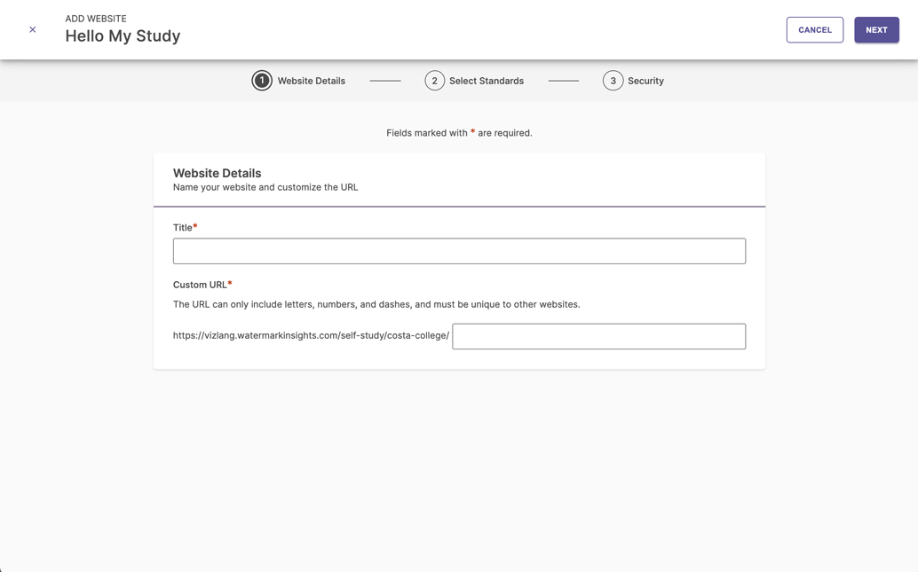
Any input field that requires interaction or information collection from the user must be marked with a red asterisk next to the input field’s label. An optional input field shouldn’t have any additional text or icons next to its label to indicate it’s optional.


Required Fields Text Placement
Whenever there are asterisks indicating required fields in a page or container, it’s important to inform or remind users what they mean. We use a standard message for this purpose: “Fields marked with * are required.” This message is displayed prominently inside the page or container, either in the header or in the content area.


Do’s and Don’ts for Required Fields
Do:
- Use the red asterisk to indicate all required fields.
- Ensure the required fields text is placed in a prominent location and clearly connected with the required inputs’ asterisks.
Don't:
- Use any indicators for optional fields.
- Place the required fields text in a place where users may easily miss it.
- Repeat the required fields text in multiple locations for one context.