We use specific layout structures, containers, and patterns to group information and create consistent experiences in our products.
Page LayoutsLayout ContainersLayout Patterns
Page Layouts
The following are foundational page layouts. We build on these layouts by adding containers and patterns.
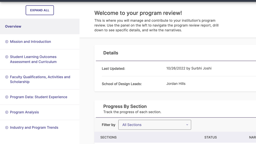
Primary Layout with Navigation
This is the primary layout structure for each product. At minimum, it features the main navigation, the app bar, a page header with a title, and a content area with a title.
An example of a primary layout with navigation from Planning & Self-Study.
An example of a horizontal primary navigation from Faculty Success.
Best Practices
Use as a landing page of main navigation items
Provide users with easy access to the main navigation
Containers that can be used within:
Cards, tables, side panels, flyouts, dialogs, modals, full page panels, and snackbars.
Patterns that can be used within:
Tabs, toolbars, forms.
Do not use if navigating to another page would compete with the user’s current task or experience
Responsiveness
Vertical Navigation Menu
Hide the vertical menu into a collapsible menu at a breakpoint of 1024px
This ensures the page content maintains enough space to avoid feeling cramped.
Horizontal Navigation Menu
Move horizontal navigation items into a collapsible menu
The menu should adjust as soon as all the menu items no longer fit horizontally within the view port. This width may vary across products.
App Bars
Ensure product logos fit entirely within the new viewport
Logos should adapt to fit by changing size to fit the smaller space.
Hide text on actions that are paired with icons to help fit within the new viewport
Ensure to include tooltip text that clearly describes the action.
Do not stack items in the app bar
The app bar should have a consistent height across all viewports to ensure that the vertical space remains uniform.
Immersive Layouts
Immersive layouts are used to dive deeper into a particular product area. By removing the app bar and main navigation, they allow users to be fully focused and absorbed in an experience.
There are two main immersive layout types, one to display extensive details about a specific product area, and the other to collect complex, multi-faceted information from users through multiple tasks and actions. Immersives may or may not have a unique URL.
Best Practices
Use to prevent users from navigating away to a different page through the main navigation
Use for contained flows with details, multiple tasks, and multiple actions related to one objective
Containers that can be used within:
Cards, tables, side panels, flyouts, dialogs, modals, and snackbars.
Patterns that can be used within:
Tabs, toolbars, forms, steppers.
Avoid if users need to access other areas of the system through the main navigation
Responsiveness
Wrap header text and descriptions
This keeps the content visible when the container adjusts to the smaller viewport.
Wrap actions below the header text and descriptions
Ensure that the actions are aligned to the right, maintaining a consistent position with the larger version. Stack actions if there are multiple that do not fit horizontally.
Do not stack the close or back action to its own line
Keep the close or back action to the left of the title. This maintains the tab order and prevents the header from becoming too tall.
Dark Immersive
An example of an immersive layout with tabs showing extensive details for a product area.
These views can be launched from the primary layout or dark immersive layouts.
Break up workflow
Other pages from this view should relate to the main immersive tasks.
Use breadcrumbs to indicate hierarchy location
Breadcrumbs can be used to indicate where this view came from, but is not required.
Must use a primary action to complete the task
Primary actions on the right are required to complete the task and close the view. Also use the close “x”, rather than a back arrow, on the left to close and return to the previous view.
Do not navigate to other pages
These views are to complete singular tasks and do not navigate to other views.
Layout Containers
The following are layout containers that present groups of information, tasks, or actions.
Card
Cards are containers of information and guide users to further actions and details by organizing and breaking up content.
They may display information using a combination of text and data visualization, and use buttons and links for additional information and actions. Cards are variable in width and height. Multiple cards may appear in a content area as a stacked list, or side-by-side in a grid layout.
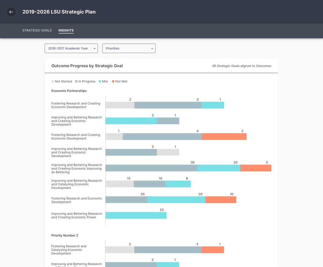
An example of a card with a chart in Planning & Self Study
Use to provide a high level overview of information
Use to group information on a page or in a dashboard view
Use to present list items and related details in separate containers
Actions inside cards may trigger other components on a page level
These actions can open side panels, flyouts, dialogs, modals full page immersives, and snackbars.
Patterns that can be used within:
Tabs, forms, and steppers.
Containers that can be used within:
Only table containers can be used within cards.
Responsiveness
Reduce columns and stack cards as the viewport shrinks
The breakpoints at which columns reduce depend on the content within the cards.
Transform content within cards to shrink
Wrap text and stack content within cards as card widths decrease.
Consider reducing margins and card containers at smaller viewports
Cards with content contained in more card containers may appear too busy at mobile viewports. Consider removing the amount of containers to clean up the view.
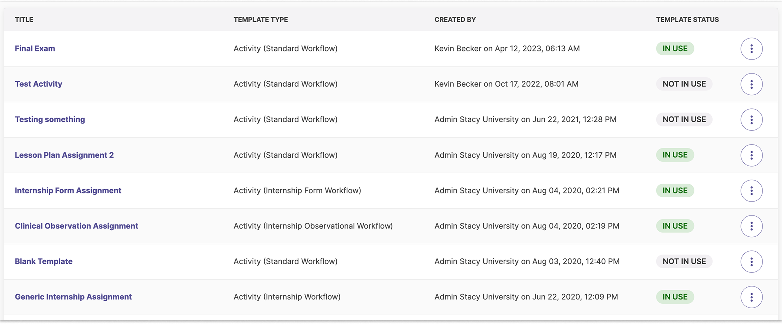
Table
Tables are containers that present large amounts of data with multiple rows and columns. A table may be paired with filtering and sorting, expand/collapse functionality in rows to view and hide information, status labels, and actions related to each listed item.
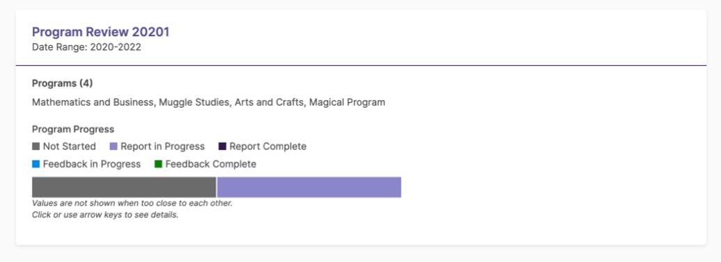
An example of a table with actions in Student Learning & Licensure
Use for comparing data or displaying lists of information
Helps users find relevant information for a specific item
Actions inside cards may trigger other components on a page level
These actions can open side panels, flyouts, dialogs, modals, full page immersives, and snackbars.
Patterns that can be used within:
Toolbars.
Do not open additional containers within tables
Responsiveness
Data tables are an exception to the reflow criterion and may have horizontal and vertical scrolling, however there are various methods for table responsiveness to prevent horizontal scrolling.
Collapse tables into a 2 column layout at smaller viewports for a better experience
Display column headers in the first column and the corresponding row data in the second. This pattern is effective for tables with many columns and preserves clarity on narrow screens. View this behavior on the Data Tables Codepen (data table link opens in new window).
Side Panel
A side panel is a container that pushes into and lives side-by-side with the main content area so that important information can be seen in one view.
An example of a left side panel in Planning & Self Study
Use to show supplementary or helpful information related to items in the content area
Use when the user is expected to reference or interact with information in the content area while completing or reviewing a task in the side panel
Can open from the right or left
Open the side panel from the left if it includes navigational actions that affect the main content. Other types of actions within side panels can either be on the left or right depending on what makes sense for your use case.
Actions can trigger dialogs, modals, and snackbars
Containers that can be used within:
Only table containers can be used within side panels.
Patterns that can be used within:
Tabs and forms.
Avoid if the user does not need to reference information from the main content area
Consider using flyouts instead to focus the user’s attention.
Responsiveness
Collapse side panels on smaller screens to ensure enough space for the main content.
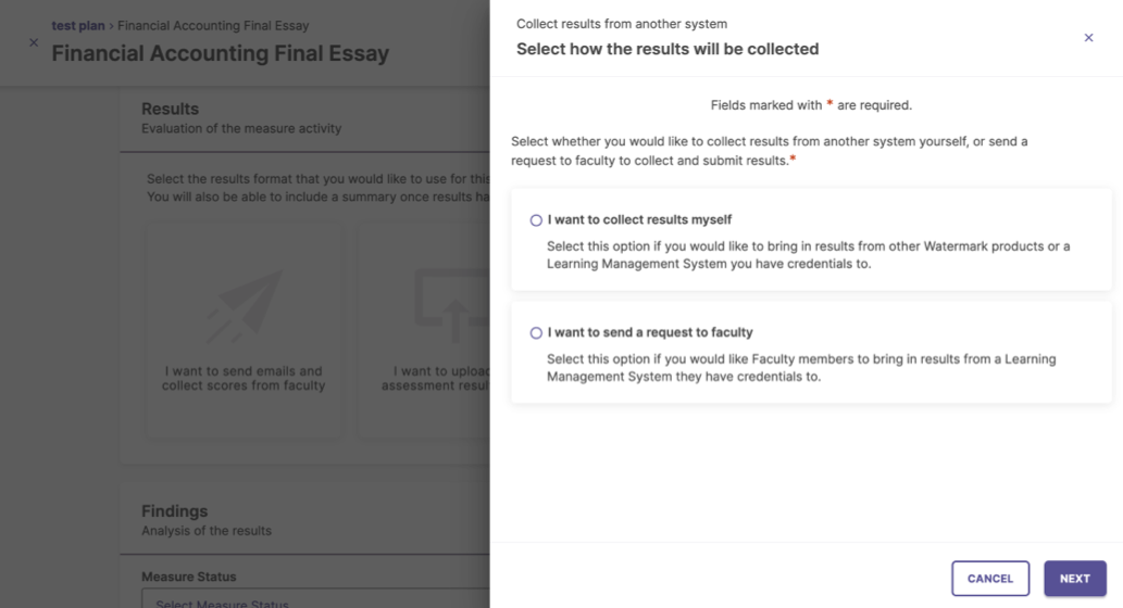
Flyout
Flyouts are containers that slide in from the right, providing supplementary information and collecting data without requiring navigation away from the underlying page or flow.
Allows users to complete single tasks without navigating away
Can contain tables and various data inputs to complete tasks.
Keep tasks in flyouts simple and quick to complete
For more complex workflows, use light immersive views instead.
Use steppers to break up forms into manageable sections
Aim for 2–3 steps to keep the workflow straightforward and avoid unnecessary complexity.
Actions can trigger dialogs, modals, and snackbars
Flyouts can be launched from main pages and immersive views
Avoid launching flyouts from other flyouts or modals and dialogs
Avoid if there is a lot of content to display in one view
Consider using light immersive views to provide more information in a full page.
Responsiveness
Flyouts can be multiple sizes depending on the content, and become full screen when the viewport is less than 534px.
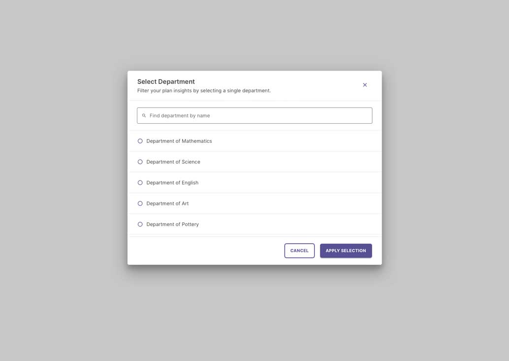
Modal
A modal is a container that appears on top of a page and requires the user to complete a specific task. Modals disable the main page content underneath until the user interacts with the modal by either completing the task or exiting.
There is no set limit to the amount of steps, but it is recommended to use the least amount of steps that make most sense for your use case.
Steps can be previewed
Allow users to tab through steps so they can preview content within each step unless the step is dependent on information from the previous step. Trigger error messages if they move past a required step without completing all the required information.
Use buttons to navigate through the steps
Include buttons to move forward (and backward if applicable) through steps. These buttons can be above within an immersive header, or below the form. Do whatever makes sense for your use case and layout.
Can be used in immersive pages and most containers to break up tasks into steps
Immersive layouts, flyouts, side panels, and modals.
Do not use steppers as tabs
Steppers should only be used during the completion of a single task. Once the user is complete with the task, use another pattern to display the information.
Breadcrumb
Breadcrumbs display the navigation structure of a site and enable the user to navigate to the previous level in the hierarchy. Use breadcrumbs in any area that the user navigates.
Primary layouts, Immersive layouts, side panels, and flyouts.
Responsiveness
If the breadcrumb becomes long and has at least three levels listed, you can use an ellipses to collapse the middle hierarchy. Keep the first and current level visible. Selecting the ellipses will expand the breadcrumb to display the entire breadcrumb.
An example of a collapsed breadcrumb.
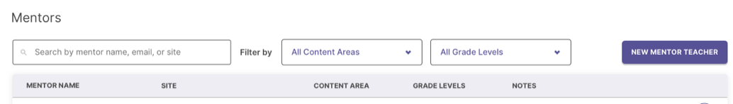
Toolbar
Toolbars offer controls and actions for filtering, searching, editing or reorganizing data inside a page or container.
An example of a filtering toolbar above a table.
Best Practices
Most layouts and containers that can use toolbars:
Primary layouts, Immersive layouts, tables, side panels, modals, and flyouts.
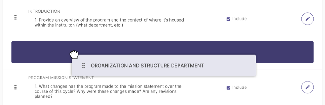
Drag and Drop
Drag and drop features can provide a streamlined experience for users by allowing elements to be selected and dragged to another location.
An example of drag and drop functionality in Planning & Self Study.
Always include an icon to indicate a container is draggable
Once the user selects and holds the icon or container, the cursor should change to a grab cursor.
Always indicate the area where the container will be placed
Highlight the area using a different color than the background.
The drag area can be limited to either the icon or entire container
If there are multiple actions within the container being dragged, you may want to limit the click and drag area to just the icon to avoid interfering interactions.
Do not use multiple layers of drag and drop elements
Do have drag and drop areas within other draggable elements. They should be limited to single areas where the same type of element is interacted with.
 Ripple
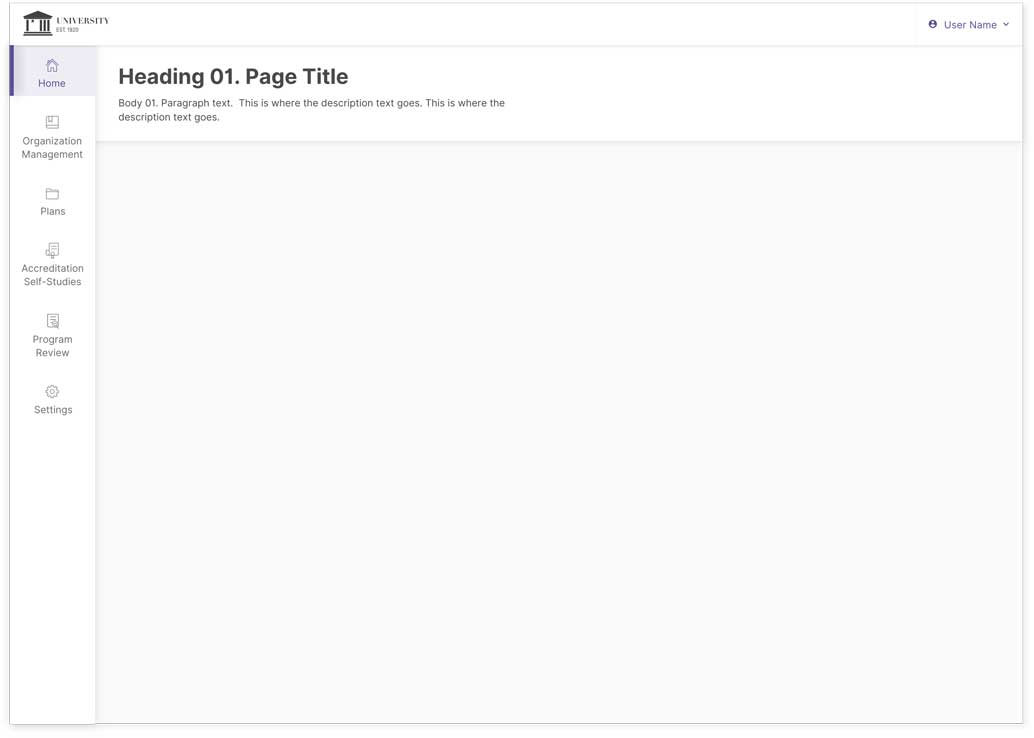


