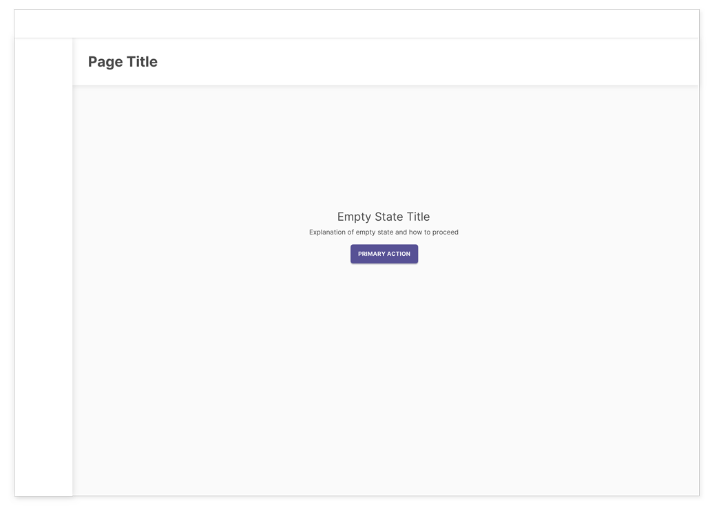
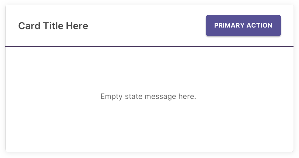
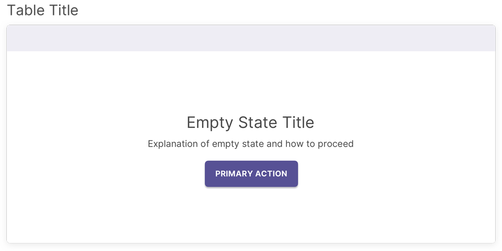
page structure
Empty States
Empty states are used in pages when there’s no content to display. The goal of a useful empty state is to inform users of the status of the page, why information isn’t displayed, and the action users can take to move forward in the experience.
These states commonly occur on first use of the product or feature when no data has yet been entered, when a user deletes or clears information on a page or in a page section, and when there’s no available data to display as a result of a search query or filter.
Empty State Content and Placement
A page level empty state must include a brief title that clearly conveys the status of the empty space, followed by a concise explanation of the reason(s) why the space is empty and/or the action users can take. A primary action should either be placed below the explanation or towards the upper right hand corner where it will appear in the populated page. In some cases, a secondary action may need to be provided. In these cases, there should be a clear distinction between the primary and secondary action.

The empty state of an individual container, such as a card, side panel, flyout, or modal, should be displayed in the content area of the container. It must include an explanation of the empty space and may include a primary or secondary action for users, if applicable. The container title, along with any other useful and applicable fields and actions should be included in all states to provide context.

Empty states should always appear in context of the missing information by replacing the element that will show once the space is populated. For example, an empty state for a table should only display the empty state information. No column headers or other information should be displayed with the empty state. This ensures that a screen reader won’t have to read through any additional information and will go directly to the empty state message.

Do’s and Don’ts for Empty States
Do:
- Keep it brief, purposeful, and in context.
- Ensure users are clearly directed towards the primary action they need to take, especially if the action isn’t placed directly below the empty state message.
Don't:
- Provide multiple or unrelated actions.
- Use lengthy paragraphs or unfamiliar terms for users.
- Lead users to a dead end.