Colors
We use a minimal palette to ensure meaningful color application for emphasis, tone, visual cues, and cohesive layouts. Our color combinations follow the WCAG 2.1 AA guidelines for minimum contrast ratios.
Ripple’s color palette has been improved to utilize color tokens. This enables Ripple components and patterns to become more consistent and scalable.
Intro to Design Tokens
What are Design Tokens
Design Tokens are reusable style values that document design decisions. This can include styles for colors, typography, layout, and spacing. Design tokens are reusable and intentionally named based on their usage.
Purpose
They serve as the source of truth for design decisions and, just as importantly, act as a shared language between design and development. Their purpose is to ensure unified and consistent product experiences by using the defined token rather than hardcoded values. This streamlines the work of building, maintaining, and scaling products that use our design system.

Token Naming Structure
- Category
- Concept
- Sub-Concept
- Property
- Variant
- State
- Mode
- Category: Category is the first level of the hierarchy and represents the visual element of design that the token is referring to, such as color, font, or size.
- Concept: The next level, Concept, can be an abstract concept for behavior or function such as interactive or brand, or point to a UI element such as button, chart, and timepicker.
- Sub-concept: Some tokens (usually ones that point to UI elements) need an additional description by using the sub-concept level when the token points to something more specific within a given concept, such as chart-label or timepicker-toggle.
- Property: All tokens need the property level to indicate what specific part of the element the token will apply to, such as background, border, or text.
- Variant: The variant level is used to distinguish additional use cases when needed, such as primary or secondary.
- State: State affects the property based on different use cases. This usually refers to interactivity such as hover, selected, or disabled.
- Mode: Some tokens need to change based on where in the product they are used. For instance, Watermark has an on-dark mode which adjusts the value for the token on dark backgrounds.
Naming a Design Token
- Category
- Color
- Concept
- Button
- Property
- Background
- Variant
- Primary
- State
- Hover
- Mode
- On-Dark
Color design tokens always begin with “color” as the category.
Color Tokens
The Design System team defines all the color tokens to be used throughout Ripple. Each color token begins with “wmcolor” so that our color tokens are unique.
Global Tokens
To get started we defined the global color tokens to serve as the foundation for all colors by directly referencing color hex codes. These include all the colors documented on Global Colors.
Alias Tokens
Any token referring to another token is known as an alias token. Alias tokens serve the rest of the component specific color tokens and are named purposefully so it is clear where the token should be applied. This ensures the color is being used properly and consistently. Always use alias tokens instead of using global tokens when setting a color value. All available alias tokens can be seen in the Color Token Library.
Component Color Tokens
Component tokens should only be used for the specific component they are referencing. These tokens use the alias tokens to define the color. That way if a change is made on the alias token, that change will affect the component token. This enables us to efficiently scale and seamlessly make updates across components, without having to directly touch the component token. Whenever a new component is created by the Design Systems team, new component color tokens are also created to properly define the new component.
Applying the Tokens to the Component

How to Use Color Tokens
It is important to correctly apply color tokens for both designers and developers to maintain unified product experiences. These tokens were defined for a specific purposes and misusing them will create inconsistencies that could cause usability and accessibility issues.
Designers
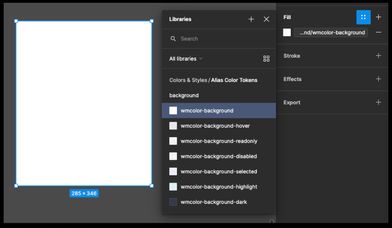
All alias and global color tokens have been added to the Colors & Styles Figma file. Using the library of colors enables the Developers to reference the proper color token when developing the designs.
How to apply tokens
All color tokens can be applied using the styles panel. Use these colors to apply to design elements that are not pre-created reusable components. Reusable components already have component specific tokens applied and, just like developed components, these color tokens should not be reused outside of the components they are tied to.
Requesting Changes & Updates
To update tokens or add additional tokens, designers should follow the same process as requesting new Figma components by reaching out to the Design Systems team or creating a request ticket (link opens in new window). The Design Systems designer can recommend the best color token to use until the updates can be made.
Developers
How to apply tokens
The color tokens are available as CSS variables in a file on the Watermark CDN that will serve as the source of truth. The latest version of the file will be listed on the Ripple homepage.
If a designer makes use of color tokens, developers can use the inspection mode of Abstract or Figma to identify it by the color swatch name or style value.
How to use these colors
The color tokens documented here only include the alias color tokens available for use for UI elements that are not Ripple components. Use the following information to find the token names and understand how to properly apply them.
Can’t find the color for your use case? Contact the Ripple Team.
Filter Tokens
The UI Element the color will be applied to
The interactive state of the component
Interactive
These tokens are used as the alias token for all interactive components and change based on the theme the product is set to.
| Token Name | Default | Neutral | Usage |
|---|---|---|---|
| wmcolor-text-link |
Text links on light backgrounds Text Link, Text |
||
| wmcolor-interactive |
Indicates an element is interactive Buttons, Actions, Backgrounds, Border |
||
| wmcolor-interactive-hover |
Hover color for interactive elements that use wmcolor-interactive Buttons, Backgrounds, Hover |
||
| wmcolor-interactive-ondark |
Indicates an element is interactive on dark backgrounds Buttons, Actions, Backgrounds, Text, On-Dark |
||
| wmcolor-interactive-hover-ondark |
Hover color for interactive elements on dark backgrounds that use wmcolor-interactive-hover-ondark Buttons, Actions, Backgrounds, On-Dark, Hover |
||
| wmcolor-interactive-disabled |
Indicates an interactive element is disabled Buttons, Links, Text, Backgrounds, Disabled |
||
| wmcolor-interactive-disabled-ondark |
Indicates an interactive element is disabled on dark backgrounds Buttons, Links, Text, Backgrounds, On-Dark, Disabled |
||
| wmcolor-interactive-text |
Text that is on top of interactive background colors Text, Primary Button |
||
| wmcolor-interactive-text-ondark |
Text that is on top of interactive background colors that use wmcolor-interactive-ondark Text, Primary Button, On-Dark |
||
| wmcolor-interactive-text-selected |
Text on interactive background colors in a selected state Date-Picker, Text, Selected |
||
| wmcolor-interactive-text-disabled-ondark |
Text on disabled interactive background colors Primary Button, Text, On-Dark, Disabled |
||
| wmcolor-interactive-background-hover |
Hover color for interactive elements that use a light background Navigation, Select, Time-Picker, Date-Picker, Tag-Input, Backgrounds, Hover |
||
| wmcolor-interactive-background-focus |
Focus color for interactive elements that use a light background Navigator, Select, Backgrounds, Focus |
||
| wmcolor-interactive-focus |
Focus color on interactive elements All interactive components, Border, Focus |
||
| wmcolor-interactive-delete |
Color for delete actions Delete Buttons, Backgrounds, Text |
||
| wmcolor-interactive-delete-hover |
Hover color for delete actions Delete Buttons, Backgrounds, Hover |
||
| wmcolor-interactive-negative |
Color for actions to convey a negative connotation Negative Buttons, Backgrounds |
||
| wmcolor-interactive-negative-hover |
Hover color for actions that convey a negative connotation Negative Buttons, Backgrounds, Hover |
||
| wmcolor-interactive-positive |
Color for actions to convey a positive connotation Positive Buttons, Backgrounds |
||
| wmcolor-interactive-positive-hover |
Hover color for actions that convey a positive connotation Positive Buttons, Backgrounds, Hover |
Layout
These tokens are used as the alias token for most layout components. These do not change based on theme.
| Token Name | Color | Usage |
|---|---|---|
| wmcolor-background |
Color for light content backgrounds Most Containers, Inputs, Background |
|
| wmcolor-page-background |
Used for the main background behind content on product pages Product background behind content, Background |
|
| wmcolor-card-background |
Color for card containers Cards, Background |
|
| wmcolor-background-readonly |
Indicates a read-only state for light backgrounds File-List, Inputs, Navigator, Tag-Input, Background, Read-only |
|
| wmcolor-background-dark |
Color for dark content backgrounds. Use on-dark colors for text and icons on this background. Dark Immersive Header, Snackbar, Background |
|
| wmcolor-background-dark-secondary |
Color for secondary headers that are paired with headers using wmcolor-background-dark Secondary header to Dark Immersives, Background |
|
| wmcolor-background-disabled |
Indicates that content is disabled on light backgrounds Inputs, Background, Disabled |
|
| wmcolor-background-selected |
Indicates a selected state on light backgrounds Select, Navigator, Background, Selected |
|
| wmcolor-background-highlight |
Indicates a highlighted state for content on light backgrounds Table-Row, Tag-Input, Line-Chart, Background, Highlight |
|
| wmcolor-border |
Use as the main border color for divider lines File-List, Table, Charts, Border |
|
| wmcolor-border-light |
Use for borders that need a lighter color than the main border color Date-Picker, Select, Border |
|
| wmcolor-border-dark |
Use for borders that need a darker color than the main border color Inputs, Border |
|
| wmcolor-border-focus |
Use for focus states that have a border Inputs, Table, Border, Focus |
|
| wmcolor-table-header-background |
Background color for table headers Table, Date-Picker, Tag-Input, Background |
|
| wmcolor-table-row-background |
Background color for tables Table, Date-Picker, Tag-Input, Background |
|
| wmcolor-table-altrow-background |
Background color for alternate table rows Table, Tag-Input, Background |
|
| wmcolor-table-row-background-selected |
Background color for selected table rows Table, Tag-Input, Background, Selected |
|
| wmcolor-table-row-border |
Use as the border color for table rows. This color references wmcolor-border. Table, Border |
|
| wmcolor-table-row-border-selected |
Use as the border color for selected table rows. This color references wmcolor-border-focus. Table, Tag-Input, Border, Selected |
|
| wmcolor-option-background |
Background color for menu items Action-Menu, Select, Tag-Input, Time-Picker, Background |
|
| wmcolor-option-background-hover |
Indicates a hover state on menu items Action-Menu, Select, Tag-Input, Time-Picker, Background, Hover |
|
| wmcolor-option-background-focus |
Indicates a focus state on menu items Select, Time-Picker, Background, Focus |
|
| wmcolor-option-background-selected |
Indicates a selected state on menu items Select, Background, Selected |
|
| wmcolor-option-border |
Border color between menu items. This color references wmcolor-border-light Action-Menu, Select, Tag-Input, Time-Picker, Border |
|
| wmcolor-option-text |
Text color for menu items Action-Menu, Select, Tag-Input, Time-Picker, Text |
|
| wmcolor-option-text-disabled |
Indicate a disabled state for menu item text Action-Menu, Select, Tag-Input, Text, Disabled |
|
| wmcolor-overlay |
Use for overlay backgrounds that cover content to bring focus to modals, dialogs, and panels #191919 at 40% Opacity |
|
| wmcolor-progress |
Use for progress indicators File-List, Background |
Text
These tokens should be used for text elements.
| Token Name | Color | Usage |
|---|---|---|
| wmcolor-text |
Main text color All default text, Text |
|
| wmcolor-text-ondark |
Main text color on dark backgrounds All default text, Text, On-Dark |
|
| wmcolor-text-readonly |
Indicates a read-only state for text Inputs, Text, Read-Only |
Icon
These tokens should be used for icon elements.
| Token Name | Color | Usage |
|---|---|---|
| wmcolor-icon |
This pairs with the default text color wmcolor-text All default icons, Icon |
|
| wmcolor-icon-ondark |
This pairs with the default text color wmcolor-text-ondark for use on dark backgrounds All default icons, Icon, On-Dark |
|
| wmcolor-icon-accent |
Supplemental icons paired with other elements Icon, Read-Only |
Semantic
These tokens are referenced by other alias tokens and provide the base for semantic color usage that represent a positive or negative connotation.
| Token Name | Color | Usage |
|---|---|---|
| wmcolor-text-positive |
Text color for positive messages. This color references wmcolor-positive. Charts, Text |
|
| wmcolor-positive |
Alias token to indicate a positive connotation File-List, Icon |
|
| wmcolor-positive-dark |
Use for text or icons on backgrounds using wmcolor-background-positive Text, Icon |
|
| wmcolor-background-positive |
Background color for content areas that have a positive connotation Backgrounds |
|
| wmcolor-text-required |
Use for required messages, usually on form components. This color references wmcolor-negative. Text |
|
| wmcolor-text-negative |
Use for text to indicate a negative message. This color references wmcolor-negative. Charts, Text |
|
| wmcolor-text-error |
Use for error messages. This color references wmcolor-negative. Form Component Errors, Text, Error |
|
| wmcolor-negative |
Alias token to indicate a negative connotation Text, Icon |
|
| wmcolor-background-error |
Background color for content areas that contain error messages File-List, Background, Error |
|
| wmcolor-border-error |
Use for error states that have a border. This color references wmcolor-negative. File-List, Inputs, Border, Error |
Brand
Brand tokens are referenced by other alias tokens to provide the foundation for the themes, either the periwinkle purple for our Watermark branded products set as default, or the mom jeans blue for neutral branded products.
| Token Name | Default | Neutral | Usage |
|---|---|---|---|
| wmcolor-brand |
This is the main Watermark brand color used in various areas Alias token for wmcolor-interactive |
||
| wmcolor-brand-dark |
This is the secondary main Watermark brand color used in various areas Navigator, Background |
No tokens match the applied filters
Try selecting different filter options to find tokens
Global colors include all the colors we support and provide the foundation for all our color token definitions. Expand each section to find the color token to use to apply the color.
Need a new color or variation of an existing color? Contact the Ripple Team.
A This label shows accessible and applicable text and background combinations.
Grays
These colors are mostly used for background elements and text.
| Color | Hex | Color combinations | |
|---|---|---|---|
|
White
|
#FFFFFF |
|
|
Color Tokens Available |
|||
|
Snow
|
#FAFAFA |
|
|
Color Tokens Available |
|||
|
White Smoke
|
#F4F4F4 |
|
|
Color Tokens Available |
|||
|
Pale Lilac Gray
|
#E9E7EC |
|
|
Color Tokens Available |
|||
|
Pale Lilac Gray Dark
|
#D2D0D4 |
|
|
Color Tokens AvailableLayout |
|||
|
Cement
|
#AFADB1 | ||
|
Charcoal
|
#4A4A4A |
|
|
Color Tokens Available |
|||
|
Asphalt
|
#353B48 |
|
|
Color Tokens AvailableInteractiveLayout |
|||
|
Meteorite
|
#454B57 |
|
|
Color Tokens Available |
|||
Interactive
These colors are used for elements that can be interacted with.
| Color | Hex | Color combinations | |
|---|---|---|---|
|
Periwinkle
|
#575195 |
|
|
Color Tokens AvailableBrand |
|||
|
Periwinkle Dark
|
#464177 |
|
|
Color Tokens AvailableInteractive |
|||
|
Orchid
|
#B36DCD |
|
|
Color Tokens AvailableInteractive |
|||
|
Gray
|
#6B6B6B |
|
|
Color Tokens AvailableIconInteractiveLayout |
|||
|
Gray Light
|
#A6A6A6 |
|
|
Color Tokens AvailableInteractive |
|||
|
Cyan
|
#19A1A9 |
|
|
Color Tokens Available |
|||
|
Cyber
|
#DDF1F2 |
|
|
Color Tokens Available |
|||
|
Pale Violet
|
#EEEDF7 |
|
|
Color Tokens Available |
|||
Semantic
These colors should be used where it is important to convey a positive or negative meaning.
| Color | Hex | Color combinations | |
|---|---|---|---|
|
Forest Light
|
#DAECD9 |
|
|
Color Tokens AvailableSemantic |
|||
|
Forest
|
#088000 |
|
|
Color Tokens Available |
|||
|
Forest Dark
|
#054D00 |
|
|
Color Tokens AvailableSemantic |
|||
|
Firetruck Light
|
#F6E1DF |
|
|
Color Tokens AvailableSemantic |
|||
|
Firetruck
|
#C0392B |
|
|
Color Tokens Available |
|||
|
Firetruck Dark
|
#9A2E22 |
|
|
Color Tokens AvailableInteractive |
|||
|
Firetruck Darker
|
#73221A | ||
|
Cyan Dark
|
#15868D |
|
|
Color Tokens AvailableInteractiveLayout |
|||
|
Cyan Darker
|
#116B71 |
|
|
Color Tokens AvailableInteractive |
|||
|
Salmon Dark
|
#CC4C3E |
|
|
Color Tokens AvailableInteractive |
|||
|
Salmon Darker
|
#A33D32 |
|
|
Color Tokens AvailableInteractive |
|||
Neutral Interactive
These colors are used for all interactable elements in products that have custom institution colors and need a non-branded neutral primary color.
How to apply these colors
These colors are associated to the neutral theme that can be applied on a site-wide scale. Use the appropriate color token based on the usage and the neutral color will automatically be applied with the theme.
| Color | Hex | Color combinations |
|---|---|---|
|
Mom Jeans
|
#366DAE | |
|
Dad Jeans
|
#244974 | |
|
Blueberry
|
#667EED | |
|
Acid Wash Jeans
|
#9BB6D7 | |
|
Linen
|
#E1E9F3 | |
|
Sleet Lighter
|
#ECEFF3 |
Data visualization colors are separate from our global colors and color tokens. These colors can be broken into 3 categorical palettes and have specific uses for implementation.
Categorical Data
The categorical (or qualitative) data palette is used to distinguish 2 to 6 states of data. Use these colors for charts that have data belonging to the same category. These colors have associated meaning and can be used in any order.
All of our Donut Chart Components and most of the bar charts except bar chart 7 use these colors.
| Color | Hex | Color meaning |
|---|---|---|
|
Gray
|
#6B6B6B | Use for an incomplete, unknown, or not started state |
|
Periwinkle
|
#575195 | Use for a neutral connotation |
|
Lavender
|
#8B86CA | Use for a neutral connotation |
|
Midnight
|
#2E1B46 | Use for a neutral connotation |
|
Cyan
|
#19A1A9 | Use for a positive connotation |
|
Salmon
|
#FF5F4E | Use for negative connotation |
Discrete Categorical Data
The discrete categorical data palette is used to distinguish 2 to 7 states of data that do not have an inherent correlation. It is reccomended to use the colors in the following order so that each color has maximum color contrast from one another.
Bar Chart 7 and the Line Chart Component use this color palette.
| Color | Hex |
|---|---|
|
Lavender
|
#8B86CA |
|
Midnight
|
#2E1B46 |
|
Tobias Blue
|
#0089E4 |
|
Forest
|
#088000 |
|
Orangutan
|
#EA8500 |
|
Salmon Dark
|
#CC4C3E |
|
Mom Jeans
|
#366DAE |
Sequential
Sequential palettes are used for data that is related and needs to display increasing or decreasing order. This is distinguished by using darker hues (shades) and lighter hues (tints) of the same color.
Some of these palettes are being used in the new map tiler data visualization pattern. Reference these colors whenever the need arrises. 2 to 7 colors can be chosen based on the use case.
Colors must meet a ratio of 3:1 to meet Web Content Accessibility Guidelines' AA standards for graphical objects. Any color that is below this ratio and used on it’s own must have an outline that does meet the standard. Reference the color contrast ratio against white noted under each color.
 Colors must meet a ratio of 3:1 to meet Web Content Accessibility Guidelines' AA standards for graphical objects. Any color that is below this ratio and used on it’s own must have an outline that does meet the standard. Reference the color contrast ratio against white noted under each color.
Salmon Palette
-
#FFE7E4
1.2:1
-
#FFCDC8
1.4:1
-
#FFE7E4
3:1
-
#CC4C3E
4.5:1
-
#A33D32
6.4:1
-
#732B23
10:1
-
#59211B
12:1
Cyan Palette
-
#DDF1F2
1.2:1
-
#B8E2E4
1.4:1
-
#19A1A9
3.1:1
-
#15868D
4.4:1
-
#116B71
6.2:1
-
#0B484C
10.3:1
-
#09383B
12.8:1
Purple Palette
-
#EEEDF7
1.2:1
-
#DBD9EF
1.4:1
-
#8B86CA
3.3:1
-
#575195
7:1
-
#464177
9.2:1
-
#3C2D60
12:1
-
#2E1B46
15.4:1
Mom Jeans Palette
-
#E1E9F3
1.2:1
-
#C1D2E6
1.5:1
-
#9BB6D7
2:1
-
#366DAE
5.3:1
-
#244974
9.2:1
-
#18314E
13.2:1
-
#13263D
15.3:1
Sleet Palette
-
#ECEFF3
1.1:2
-
#D7DFE6
1.3:1
-
#7F97AD
3:1
-
#5F7182
5:1
-
#4C5B68
7:1
-
#39444E
10:1
-
#2C353D
12.5:1