What is the WCAG Reflow Guideline? What are some common situations that can create reflow issues, and how can we solve them?
The WCAG Reflow guideline seeks to ensure that content is presented without requiring the user to scroll in two dimensions when the user zooms in or is using a smaller device. This guideline is important because people with low vision who require larger text rely on magnification and find it difficult to read long lines of text. It is also helpful for mobile users. For our Watermark products that basically means our content should not scroll horizontally at a width equivalent to 320 CSS pixels. A device with a viewport width of 1280px at 400% zoom is equivalent to a width of 320 pixels.
How and when content reflows is a design decision. Responsive Web Design (RWD), an approach to web design that aims to make websites that adapt to all screen sizes and resolutions, is at the heart of complying with the reflow criterion. Utilizing the key concepts of RWD—flexible layouts, flexible images, and CSS media queries—we can prevent horizontal scrollbars in our products. Developers should partner with designers early to identify and define reflow breakpoints and behaviors, especially for complex layouts.

In general, since horizontal scrollbars are the result of content that is wider than the available space, we can prevent that by avoiding fixed widths in favor of relative units (such as percentages and rems) and taking advantage of CSS flexbox and grid. With the proper CSS, most reflow issues can be resolved today based on the space available, but CSS media/container queries allow us to make those decisions based on the viewport/container element width as well when necessary.

A few common situations can create reflow issues. Handling them ahead of time can save a lot of headaches down the road. Below are a few possible solutions to these common problems, but keep in mind that there is no substitute for testing. Testing should be done by adjusting your browser width from the maximum width available on your device, down to a minimum of 320px wide, as well as by zooming to 400% at 1280px in order to spot any problems that might result from the aspect ratio (like with sticky headers and footers as mentioned below).
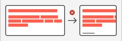
Navigation Menus
Our products use a horizontal navigation menu within a header bar, and some products also have a contextual navigation menu on the left side. Below a certain width, the top navigation items will not have enough space to remain in a single line without overlap. At some point also, the main content might benefit from more screen real estate.
Possible solutions:
- Place one or both navigation lists under a hamburger menu;
- If there are icons along with text in the contextual side navigation, create a collapsible menu by moving the text to a tooltip;

Do not reduce the text size since part of the reflow criterion’s objective is to allow users who need bigger text to be able to zoom in comfortably.
Headers with Buttons
A common layout pattern within our products is to have page headers and card headers with left-aligned text and right-aligned buttons. At smaller screen widths, the forced side-by-side positioning of these elements results in them extending beyond their container.
Possible solutions:
- This layout is usually done by using CSS flexbox. Allow the two sides to stack automatically if there is not enough room by employing
flex-wrap: wrap; - Choose a reasonable width based on the content at which the buttons will appear below the text and use CSS media queries to achieve that result;
- Maintain the side-by-side relationship but convert buttons with icon and text to icon-only buttons at a particular width. One way to do this is to use container queries or media queries to show or hide separate containers for buttons with text and without.

Multi-column Layouts
Whenever a design calls for a multi-column layout, it is likely that the number of columns will need to be reduced if the content is to flow comfortably within each section. But that is merely an aesthetic issue. The reflow problem results from static column widths that force the columns outside of their container, or flexible column widths where the minimum content width of one or more columns is wider than the preferred width.
Possible solutions:
- Use CSS grid layout to create as many columns as possible with a certain minimum width by using
auto-fillorauto-fit.auto-fillis likely to be preferable since it will create empty columns where necessary, thus maintaining the grid size if the last row has fewer elements than columns. On the other hand,auto-fitwill stretch the last row of elements to fit the container evenly.
  .multi-column-container {
      grid-template-columns: repeat(auto-fill, minmax(15.5rem, 1fr));
      display: grid;
      gap: 1.25rem;
  }
Here the element will contain as many columns as possible, and columns will be at least 15.5rem (248px) wide and evenly sized.
- Use container queries or media queries to set a different number of columns at specific breakpoints, especially at situations where the desired minimum column width would not resolve the reflow issues at smaller browser widths. If equal widths are desired,
repeatis a convenient way to create the number of columns: you can writerepeat(4, 1fr)instead of1fr 1fr 1fr 1fr.
  @container columns (min-width: 30.9375rem) {
      .multi-column-container {
          grid-template-columns: repeat(2, 1fr)
      }
  }

  @container columns (min-width: 45.5rem) {
      .multi-column-container {
          grid-template-columns: repeat(3, 1fr)
      }
  }
Images
Images at fixed sizes will break out of their containers and create a reflow issue. Generally, images should not be larger than their actual size, but most times shrinking them to fit their containers is desired.

Images are an exception to the Reflow guideline if they require two-dimensional layout for usage or meaning, which usually means only maps and diagrams.
Possible solution:
- Flexible image widths can be a part of your CSS reset with the addition of
max-width: 100%andheight: autoto all images. This shrinks the width of the image to the width of its container while maintaining its aspect ratio.
Tables
Large data tables will commonly cause horizontal scrolling on smaller screens.
Possible solutions:
- Stacking the table content so that each row is represented in a header/cell vertical arrangement will allow users to understand the content without having to scroll in both directions; See an example of this behavior on codepen.
  @media screen and (width <= 50rem) {
    .data-table {
        display: grid;
        grid-template-columns: [fullrow-start rowhead-start] fit-content(30%) [rowhead-end cell-start] auto [cell-end fullrow-end];
        column-gap: .625rem;
        padding: 0;
    }

    .data-table tbody,
    .data-table tbody tr,
    .data-table .datacell {
        display: grid;
        grid-template-columns: subgrid;
        grid-column: fullrow;
    }

    .data-table caption {
        grid-column: fullrow;
    }

    .data-table .datacell * {
        grid-column: cell;
    }

    .data-table .datacell:before {
        grid-column: rowhead;
        width: auto;
        Padding-inline-end: 0;
    }
  }
- Allow horizontal scrolling within the table’s parent container instead of forcing the entire page to scroll. This may be a better option for tables with both column and row headings. Data tables are an exception to the Reflow guideline if they require two-dimensional layout for usage or meaning.
Sticky Headers/Footers/Sidebars
Sticky headers, footers and sidebars can eat up a lot of screen real estate, especially when the user zooms in (this is why it is important to test zoom levels in addition to narrow widths).
Possible solutions:
- Use media queries to make these elements non-sticky at smaller screen widths;
- Make sidebars collapsible.
Input Fields and Labels
Forms and especially search/filter layouts often have inputs side by side or sometimes include fields with very long labels. Allowing for flexible widths and following the multi-column rules above will prevent these fields from overlapping or pushing beyond the limits of their container.
Non-breaking text
Text on the web will naturally wrap within its container, by default. In some situations, as in buttons or form labels, you may prefer for that not to be the case. In other cases, as in table cells, space might be limited, and may contain long unbreakable text like IDs. Consider how those cases should be handled as space becomes unavailable. Some options are:
- Moving buttons below other content;
- Using
word-wrap: break-wordoroverflow: wrapto force longer words to wrap; - Using
text-overflow: ellipsisto truncate text. (Use caution here if the user needs to see the full text. If so, ensure the element is interactive.)