In the fast-paced world of product design, staying ahead of the curve is crucial. As technology evolves, so do the tools and platforms that enable designers to create exceptional user experiences.
Our product design team has made the strategic decision to transition from using Sketch and Abstract to Figma. Let’s explore the reasons behind this shift and how Figma empowers Watermark Product Design to deliver even more innovative and collaborative designs.
Streamlined Collaboration
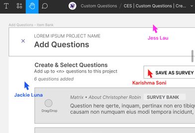
Effective collaboration is the cornerstone of successful design projects. Figma offers a cloud-based platform that allows multiple team members to work simultaneously on a design, eliminating the need for constant branching and version control. With Figma, the PD team can collaborate seamlessly in real-time, and ensure everyone is on the same page throughout the design process.

Prototyping & User Flows
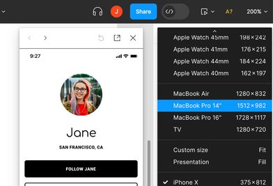
Prototyping is an essential part of the design workflow, enabling designers to test and refine their ideas before implementation. Figma's powerful prototyping capabilities allow the PD team to create interactive and dynamic prototypes directly within the tool. In addition to prototyping, designers need to demonstrate connections between screen and experiences. Some designers have done this using an additional tool called Overflow.io. Now this can all be done with Figma. We’ll save time and effort by eliminating the need to switch between different applications, resulting in a more efficient design process.

Design System Upleveling
Consistency is key when it comes to creating a cohesive user experience. Figma's design system tool-set enables the DS team to not only establish a centralized library of reusable components, styles, and assets, but to track their use and utilize this data when making roadmapping decisions. This ensures Product Designers adhere to Figma components, promoting a seamless and harmonious user experience across different products and platforms. Figma’s design library also structures the components and styles in a similar way to how designs are developed, further improving consistency and communication between designers and developers.

Future proofing
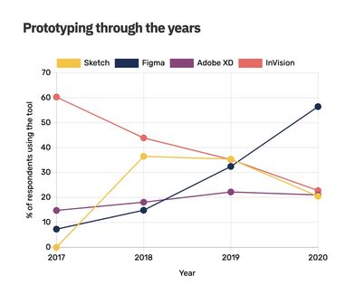
Abstract is declining, Figma is growing. Figma boasts a vibrant and active design community, offering a wealth of resources, plugins, and integrations. The PD team can tap into this larger community to gain inspiration, share knowledge, and access a wide range of plugins that enhance our designers workflow. Figma's integration capabilities also allow seamless collaboration with other tools, such as project management platforms (Jira) and design feedback tools, further enhancing the team's productivity and efficiency.

The decision of the Product Design Team to transition from Sketch + Abstract to Figma is driven by the desire to enhance collaboration, streamline the design process, and deliver exceptional user experiences. By embracing Figma, we want to create even more innovative and impactful designs, raising the bar for quality user experiences in higher ed. Teams can expect to hear more about this transition and what it means for them in Q4 2023.


