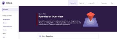
This blog article dives into the process behind redesigning Ripple’s navigation, highlighting how design research, user feedback, and iterative improvements came together to create a more intuitive and user-centered experience.
Redesigning Ripple’s Navigation
As with any significant design challenge, research, testing, and feedback are essential for creating a strong solution. While this process is a core part of a designer’s problem-solving approach, there are often obstacles, such as insufficient time for thorough user research or a lack of resources for testing and gathering feedback.
Fortunately, Ripple is uniquely positioned to maintain regular contact with our users - designers and developers - enabling us to continuously gather feedback and efficiently conduct research within our product timelines. Access to our users throughout this project was key to feeling confident about the release of our redesigned navigation experience.
Here I’ll explain the process we followed to redesign our navigation through discovery research and user testing, and how we leveraged these findings to plan for continuous discovery and enhancements.
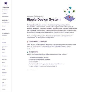
Discovery
To begin, it was essential to first identify what was working and what wasn’t in the existing navigation, to determine the areas of improvement. As a designer, I had a sense of updates needed to improve usability, and as part of the Ripple team, I knew from our roadmap that Ripple would soon outgrow the existing navigation.
Exploring User Experience with Usability Testing
Usability testing is an excellent method for evaluating products. It can provide qualitative data on areas where users experience delight and frustration, and can also generate measurable insights, or quantitative data, by assigning numeric values to questions.
To test Ripple, I scheduled one-hour sessions with 4 designers and 5 developers individually. During these sessions, I asked participants to share their screens while completing tasks in Ripple based on common use cases, encouraging them to think out loud as they worked to help us to gain insight into their thought process, and capturing a confidence rating for each task to serve as the measurable data point.
These tests revealed valuable insights into their workflow processes, mental models, and confidence levels of using Ripple for their needs. Developers reported a confidence rating between 80% and 100%, while designers had a slightly lower rating of 60% to 80%. This was observed as designers tried to find specific patterns and either couldn’t find them or it took a little searching. These values helped direct our plan for improvements.
I now understood that the way Ripple was organized worked pretty well for developers, but was lacking for designers.This kickstarted the navigation redesign effort and helped Ripple generate a plan for future enhancements.
Uncovering Insights with Research Activities
Having confirmed and identified specific needs for a better navigation experience, particularly for designers, further discovery research was required to identify the specific improvements.
Designers
For designer research, my goal was to understand how designers search for and interpret design system guidelines. To do this, I conducted a card sorting activity where users are asked to organize a collection of topics into categories that align with their mental models, reflecting how they believe the items should be grouped. This design thinking exercise helps gather insights into users’ mental models and how they organize information.
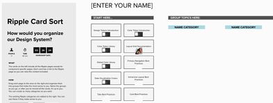
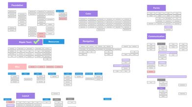
This activity helped identify key top-level categories and provided insights into where Ripple pages should be placed. I then compared these findings with the content organization of other design systems. This analysis enabled me to design a new information architecture for Ripple’s designer-focused pages.
Developers
Based on the initial usability tests, our understanding of the developer process, and references to other design systems, we concluded that components and resources for development should remain grouped similarly to the existing Ripple structure. Instead of a card sort activity for developers, we opted for a lightning demo activity. This activity is great for generating ideas for improvements and gaining insights into what users want.
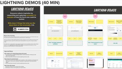
This activity revealed several ideas for improving our component examples and the presentation of component documentation. Although not directly related to navigation improvements, I was able to uncover insights into their mental models and develop a plan for future enhancements, so stay tuned!
Listening to Users
Based on the discoverability research and feedback from the internal design system team, I created the first iteration of the updated navigation to test.
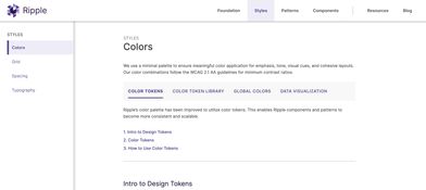
We met with the same developers and designers from the initial usability study and used the same scenarios and rating system to conduct a second usability test, this time with a prototype.
This approach enabled us to directly compare the confidence scores between the existing navigation and the redesigned navigation.
Insights Gained
After meeting with designers, I immediately observed an increase in confidence ratings with the new designs. The direct comparison of confidence scores confirmed that the new organization aligned more effectively with their mental models for how design guidelines should be structured.
For developers, they liked the organization and break up of content with the use of the top menu over the existing navigation and their confidence levels remained high.
Although this second usability test produced positive results, there still seemed to be confusion around patterns for both user types, particularly regarding what a pattern is and how it differs from other content pages in Ripple. Another area of confusion was created by landing directly on a page after selecting a category, often distracting users from their original task. These are examples of findings that could only be uncovered by actually meeting with users for feedback.
These areas of improvement required different efforts and methods to solve. For the landing page confusion, I was confident that creating overview pages for each top-level navigation category would help orient users visiting these main pages, especially since a couple of users directly suggested this idea. For patterns, there was still insufficient insight to address the problem. Further research and testing were needed to develop a robust solution.
Building with Confidence
Considering all these findings, I felt confident finalizing the design for the reorganization of Ripple, knowing that each key decision was supported by direct user testing and feedback, and that further enhancements would be planned based on these findings. As a designer, this is a good feeling.
Advancing Forward
The Ripple team is currently updating the sub-organization of patterns, leveraging key findings from testing and continuing to meet with designers to guide these updates. Next up on our plan for improvements is to explore ways to enhance the component documentation pages based on the lightning demo feedback from developers.
Overall, the redesign of Ripple’s navigation was a great experience. By successfully applying design research methods, the redesign of Ripple’s navigation resulted in immediate wins and revealed promising potential for future improvements. I want to thank all the designers and developers—your help has been invaluable, and we couldn’t have done it without you!


