We recently went about creating a smart grid algorithm for our Ripple chart component. In this article we look back at this endeavor and peek at the process of the Design System team.
In theory, the front-end developer translates the designer's specifications into code. In practice, some details are always left out of the specifications: How wide or narrow can the element get? What if the text is much longer than the one shown in the mockup? And so on. Sometimes it can be considered the designer's omission, but the reality is that it's a blurry line, and there is always a degree of interpretation in the implementation stage, as well as the discovery of edge cases that would have been hard to foresee from the drawing board.
This is an interesting part of the front-end developer's work, and also a task that her skillset is arguably more suited for than the designer's: part of the work of the programmer is to take a problem space and map it out as an organized system. Like lawyers, programmers are trained to spot logical loopholes and blind spots.
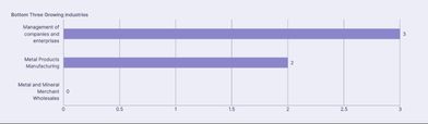
The Ripple team recently worked on adding grids to our chart component, an apparently innocuous problem, especially when looking at a static image.
The Process
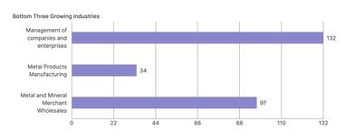
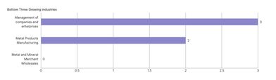
This would indeed be trivial if it were to be printed in a book. But with web content, we need a responsive grid which will work regardless of the component's width, the zoom factor, or the values passed to the chart. The mockups shown above have the same width but a different number of grid lines — respectively 4 and 5 — hinting at the fact that the number of lines adapts dynamically. Besides the number of lines, another element needing to be defined is the grid interval (the amount to increment by at each grid line). What are acceptable intervals? Obviously they should be "round numbers", but as we will see, in this context "round" needs to be defined.
In order to pin down these design requirements, the team collaborated to create a quick proof of concept that allowed us to refine the problem statement and discover which parameters we wanted to control more precisely and which could be left to the whim of the algorithm. For both the number of lines and the interval, the answer is not a single value but rather a range of possibilities whose limits need to be set.
Number of Grid Lines
We tried at first to determine a minimum and a maximum number of lines. This seemed like the obvious way to go: too many lines would overcrowd the chart, while with too few the grid would be useless. But this number depends on the chart's width. We could have determined the number we wanted at different breakpoints, but we realized that what actually matters most here is the distance between two lines, which should neither be too close nor too far apart. Using this value and the chart width, an algorithm can determine how many lines to display.
In order to find the maximum possible number of lines, all we have to do is divide the available width by the minimum spacing we set. This minimum spacing is itself dynamic, as it is visually more pleasing to allow for a narrower spacing on smaller charts. This can be done with a scaling function, which maps any number within an input range to a different range:
((width - inMin) * (outMax - outMin)) / (inMax - inMin) + outMin
width: the chart's width
inMin / inMax: input range (minimum / maximum chart width)
outMin / outMax: output range (minimum / maximum spacing)
outMin is the spacing when the chart's width is equal to inMin; outMax is the spacing when the chart's width is equal to inMax.
The designer decided that at 300px, the grid spacing should be at least 70px. At 900px and above, it should be at least 150px. Therefore in the component the function is set with the following values:
inMin = 300px
inMax = 900px
outMin = 70px
outMax = 150px
On charts smaller than 300px, the grid lines are hidden. Above 900px, the spacing remains at the maximum value of 150px.
Note: To simplify, I used "spacing" above instead of "minimum spacing". What we're calculating is in fact a value that will be used as a minimum, but sometimes the algorithm will decide to show less columns, and the spacing will be larger. So to be exact, I should have written that outMin and outMax are respectively the minimum minimum spacing and the maximum minimum spacing. Aren't we having fun?
We now have a function that will give us progressively wider values between 70px and 150px. Try it out below!
"Round" Intervals
With this maximum number of grid lines we look for an acceptable interval. We could naively start with dividing the largest number by the number of grid lines. You may have figured out what happens next:
Even if our number happened to divide into integers, arbitrary numbers are confusing:
Besides, on smaller ranges we may want decimals:
"Round" numbers in this context are numbers that nicely divide the range, in other words simple ratios. In this last example, the number 3 is divided by 6, which is the ratio ½. Six columns work for the number 3, but wouldn't work for 2 or 4: 2/6 is the ratio ⅓, 4/6 is ⅔. Both yield irrational numbers (0.3333…, 0.666…). Conversely 7 columns wouldn't work for the number 3, as 3/7 also yields irrational numbers.
We could have tried to find a number close to the largest number which nicely divides into the number of grid lines. We went about the problem the other way, first dividing the largest number by the number of grid lines (which is the minimum possible interval), then increasing from this minimum, depending on the remainder, to get an acceptable interval.
We retained the following multiplicators: 1, 1.5, 2, 3, 5, and 10. This means the grid will always go up following these increments. The magnitude of the number is irrelevant here, meaning "5" stands for 0.005 as well 5000, and can produce these two sequences:
          0	0.05	0.1	0.15	0.20	0.25

          0	500	1000	1500	2000	2500
With this constraint our chart grid will never produce sequences like these:
          13	26	39	52	65	78

          0.7	1.4	2.1	2.8	3.5	4.2

          40	80	120	160	200	240
There is nothing inherently wrong with these. Choosing acceptable intervals is just a matter of readability. We considered that 4, 6, 7, 8 and 9 produced grids that were a bit harder to read and decided not to use them.
Here is the function returning the interval when given the largest number in the chart and the number of lines:
function getInterval(largest: number, maxticks: number) {
    const minimum = largest / maxticks;
    const magnitude = 10 ** Math.floor(Math.log10(minimum));
    const residual = minimum / magnitude;
    let interval;
    if (residual > 5) {
      interval = 10 * magnitude;
        } else if (residual > 3) {
      interval = 5 * magnitude;
        } else if (residual > 2) {
      interval = 3 * magnitude;
        } else if (residual > 1.5) {
      interval = 2 * magnitude;
        } else if (residual > 1) {
      interval = 1.5 * magnitude;
        } else {
      interval = magnitude;
    }
    return interval;
  }
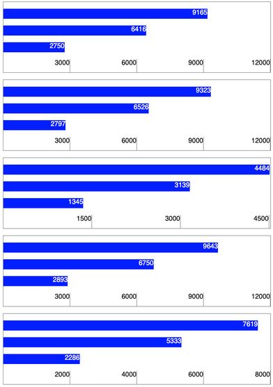
Let's say the largest bar in the chart has a value of 5883 and there are 6 grid lines. The minimum interval is 980.5, which will be rounded up to 1000. We will get a grid from 0 to 6000 (a line every 1000).
We always want the largest bar to be between the last grid line and the one before that. But because of the way we're building our grid, the largest bar can sometimes fall before that. So after we found our final interval, we can check how far the bar is from the last grid line:
distance = (interval * number of lines) - maximumNumber
If the distance is greater than the interval itself, all we have to do is drop a grid line.
Implementation
This preparatory work greatly simplified the actual implementation step, but there are still a few things to watch out for. Let's quickly look at two possible snags with the front-end code.
CSS Grid
When writing HTML markup, we often need to group elements together based on how they align. With this chart for instance, the label on the left of each bar and the bar itself are vertically centered. The easiest way to achieve this is to put them both in the same container. But the width of these labels should be the same, and will be based on the longest label. This is commonly achieved by grouping the whole column in a container. The grid cells cannot be both grouped by columns and by rows. This used to be a tricky layout problem, but was made much easier with the CSS Grid layout. Unlike prior solutions, with CSS Grid we do not represent the cells within rows or columns but as a list of sibling elements. This means no particular layout or hierarchy is assumed in the HTML markup; all of that happens entirely in CSS.
Accessibility
One of the principles of inclusive design is to offer an equivalent experience to all users. This means that when an information is provided in one way, it should also be provided in another. For instance if you are visually conveying that a field is required with a red asterisk near the label, you must also convey this information for non-sighted users (most likely with the aria-required attribute).
There are exceptions to this principle, in particular when the element is purely decorative and doesn't convey useful information. In this case the element can simply be hidden for assistive technologies. The chart grid provides guidance for visual users, but it would not be helpful, and probably confusing, if a screen reader read the numbers to a non-sighted user. It is a guide for the eye that has no meaning or usefulness in a non-visual context. Therefore we can safely hide the whole grid from screen readers, using aria-hidden="true".
Conclusions are better with collaboration
Meta: this subtitle is the fruit of collaboration with Kristian Manrique as I couldn't come up with anything better than a yawn-producing "Conclusion".
Sometimes it takes some tinkering to figure out the shape of a problem. If we had immediately started implementing the grid based on the design mockups we would have run into problems and most likely come up with a shaky solution. Spending time on the problem statement may seem unproductive on the face of it, but eventually saves time as it greatly reduces the number of hurdles in the implementation step, and the resulting code is clearer.
You can see, twist and fiddle with the component on Ripple. We're looking forward to hearing your feedback on the #designsystem channel!